
Manufacturing Pro
HubSpot Theme Guide — Install, Templates & Global Styling
Manufacturing Pro is a full HubSpot CMS theme by Dean Infotech built for industrial and manufacturing brands. It ships 14 content templates (homepage, about, product, blog, contact), 11 system pages, and a token-driven design system where brand colors, fonts, and spacing are all controlled from the theme settings panel. This guide covers installation, the template lineup, the section system, and global styling.
1. Installing the Theme
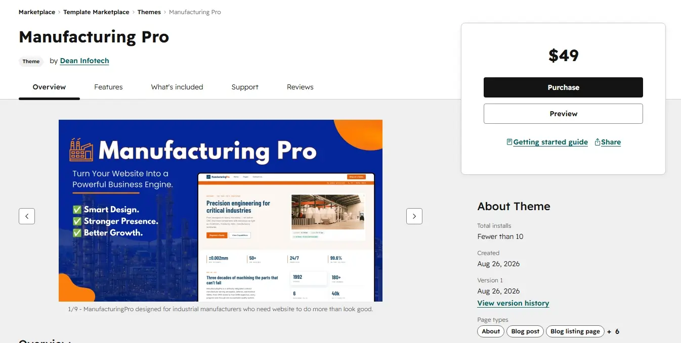
Open theme marketplace and search for Manufacturing Pro. Click on View Details and click on Purchase button. After purchasing, the theme will be availble in your Hubspot account to use.
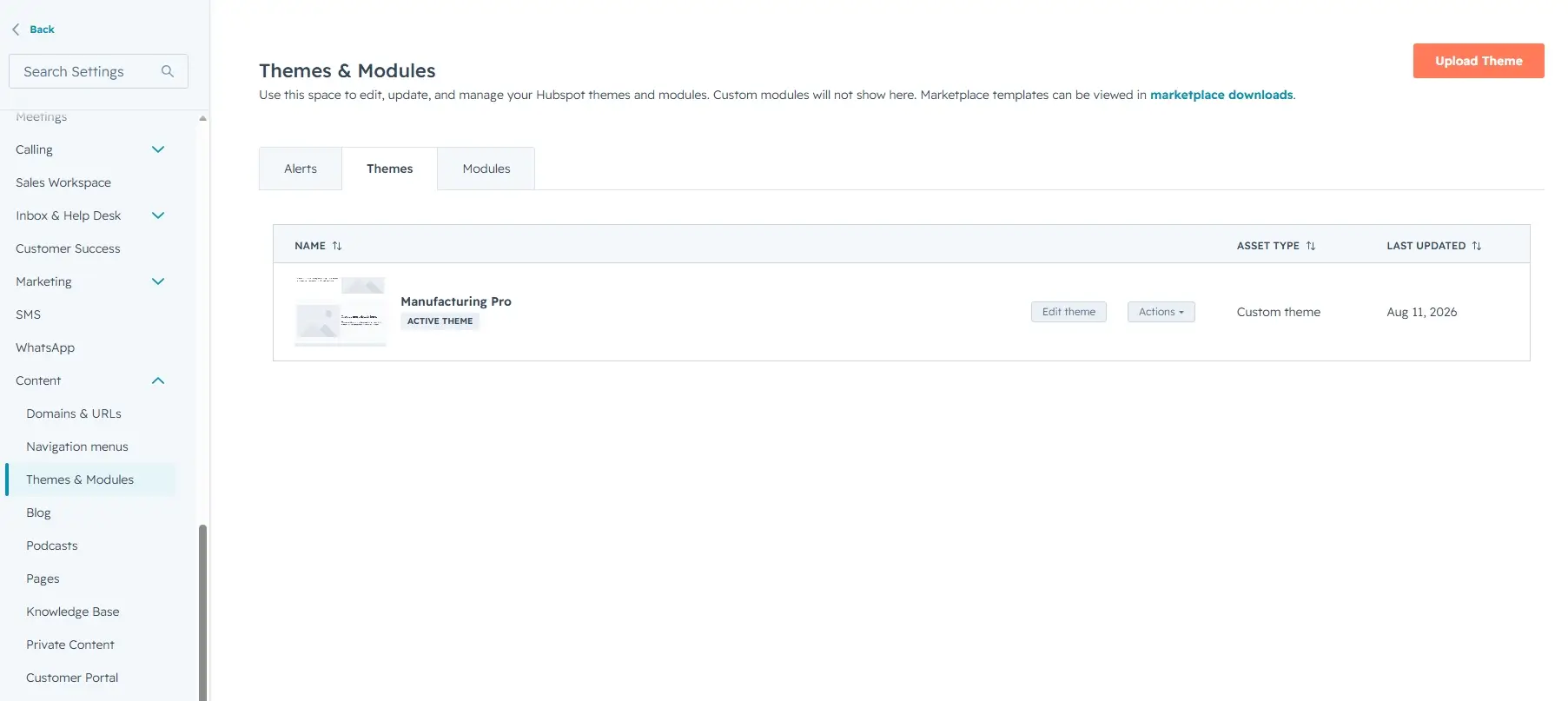
After upload, go to Settings → Website → Themes and set Manufacturing Pro as the active theme, or pick it directly from the Choose a theme screen when creating a new page.
2. Theme Structure
The theme folder is organized so each concern lives in its own directory:
| Folder | Contents |
|---|---|
templates/ |
14 content templates, plus layouts/, partials/, and system/ |
modules/ |
Global modules (header, footer, menu, button, card, CTA, pricing, social) and per-template section modules |
css/ |
token.css (design tokens), main.css, theme-overrides.css, and
ITCSS-style partials (generic/, objects/, elements/,
components/, utilities/, templates/, tools/)
|
js/ |
main.js — header/nav interactions and shared behavior |
images/ |
Default logo/favicon, placeholder images, module icons, and template/section previews |
3. Page Templates
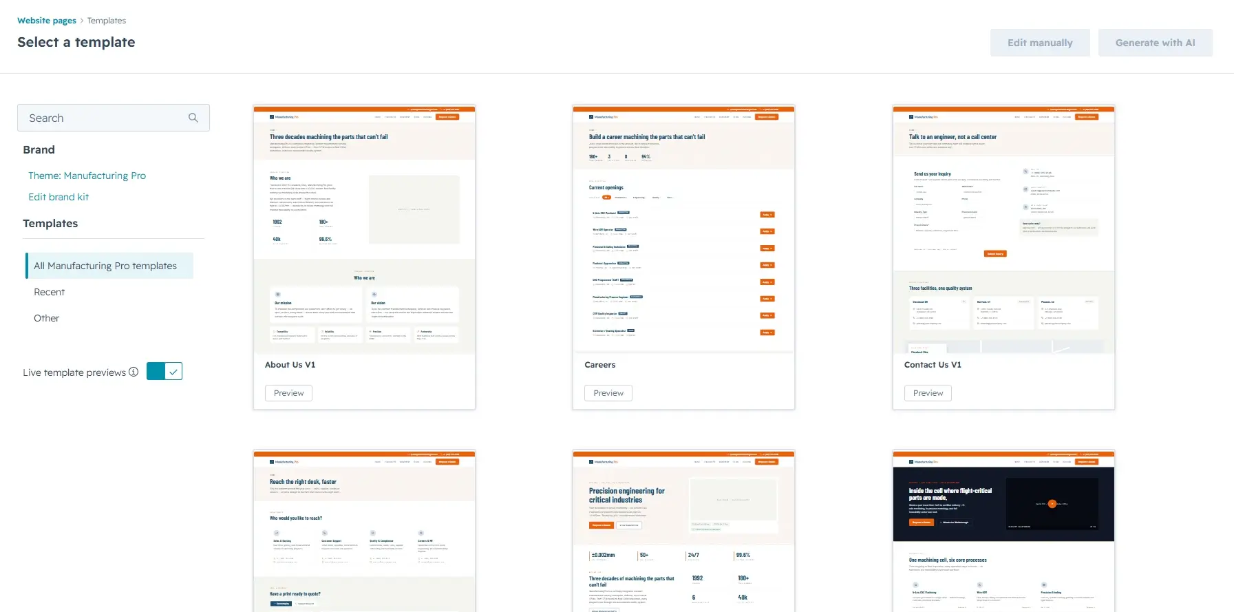
Each content template is a complete page design. Variants of the same page (for example the three homepage versions) share the same structure but arrange different sections. When creating a page, pick the template that best matches the page type:
| Template | Purpose |
|---|---|
| Homepage V1 / V2 / V3 | Three hero-first landing layouts (v1 hero card + stats, v2 alternate hero, v3 different hero layout) |
| About Us V1 | Company story, mission/vision/values, timeline, awards, certifications |
| Team Leadership V1 | Leadership team grid with bios |
| Product Listing V1 / V2 | Catalog grids — v1 standard grid, v2 alternate layout |
| Product Detail V1 / V2 | Product pages — v1 with spec table, v2 with different gallery/sidebar layout |
| Blog Listing V1 / V2 | Blog index — v1 with sidebar, v2 full-width grid |
| Blog Detail V1 | Blog post layout with author and related posts |
| Contact Us V1 / V2 | Contact pages — v1 with form + map, v2 with different contact layout |
| Blank | Empty canvas — build a page from sections |
4. The Section System
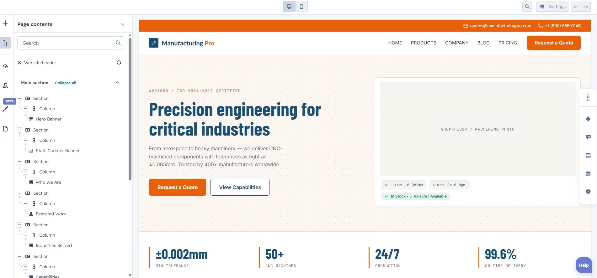
Templates are assembled from modular, reusable section modules — each page template
folder under modules/ holds the section modules used by that template. For example, Homepage V1 is
built from these sections:
- Hero — headline, subcopy, CTAs, hero card
- Stat Strip — key numbers row
- Who We Are — intro + image
- Capabilities — capability cards grid
- Industries Served — industry grid
- Featured Work — project showcase
- Quality & Compliance — certifications/standards
- Testimonial — customer quote
- Insights — blog/insights list
- CTA — closing call-to-action banner
5. Global Modules
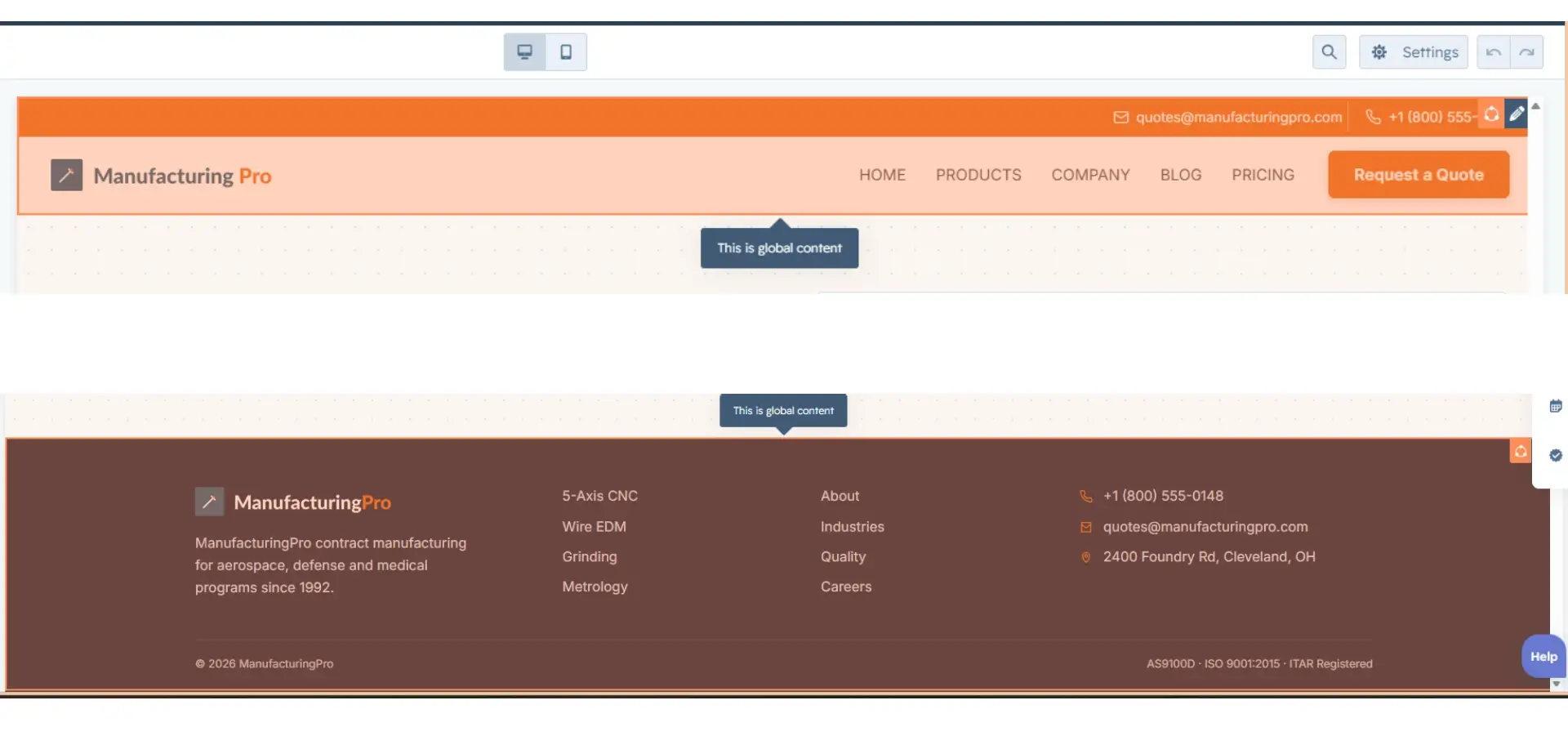
The theme includes reusable global modules available on every page:
- Header — sticky navbar with menu and CTA button
- Footer — multi-column footer with contact info and social links
- Menu — navigation menu (also powers the header)
- Button — primary/secondary CTA buttons
- Card — generic card container
- CTA Banner — reusable call-to-action band
- Pricing Card — pricing/offer card
- Social Follow — social icon links
Global modules are marked global: true in their meta.json, so edits made in
Design Manager update every page that uses them at once.
6. Global Styles (Design Tokens)
The theme is token-driven. css/token.css defines CSS custom properties for
every color, font, and spacing value, and those tokens pull their defaults from the theme settings panel —
so most re-branding happens without touching code.
6.1 Brand colors
Under Theme settings → Branding, set:
| Setting | Default | Token |
|---|---|---|
| Primary Color | #E8610A | --primary-color |
| Primary Dark | #CC4A00 | --primary-color-dark |
| Secondary Color | #1B4F72 | --secondary-color |
| Body Text Color | #3D3D3D | --body-color |
| Body Muted Color | #6B7280 | --muted-color |
| Ink Color | #111827 | --ink-color |
| Mist Color (borders) | #D9E2EC | --steel-mist / --border-color |
| Success / Warning / Info / Danger | #1E8E5A / #C98700 / #0A84C6 / #C43D3D | --success-color etc. |
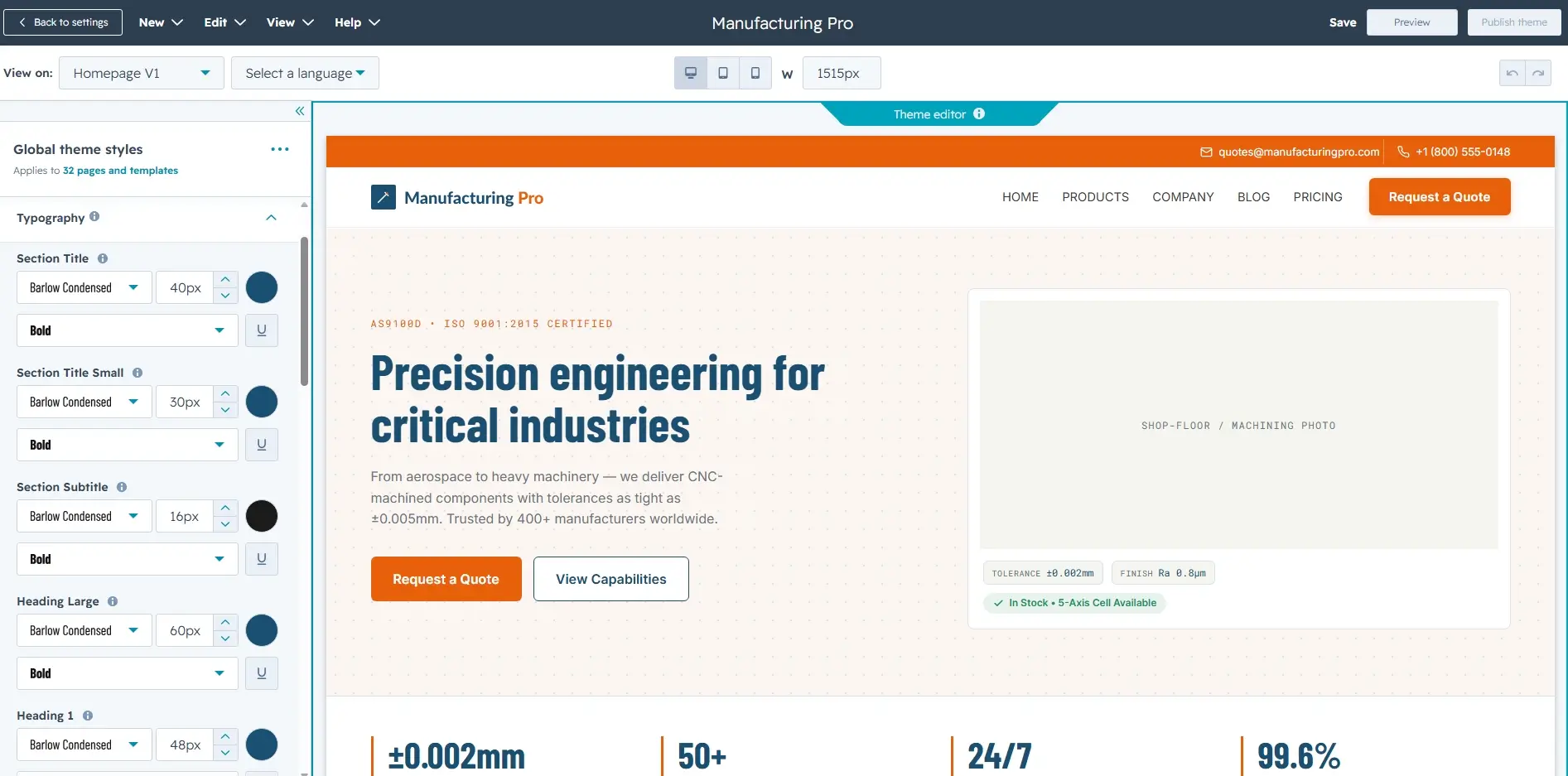
6.2 Typography
Fonts are set per text role under Theme settings →
Typography. Defaults: Barlow Condensed for headings, Inter for
body, Roboto Mono for labels/mono, Source Serif 4 for long-read content. Each
role maps to a token such as --heading-font, --body-font, and
--mono-font.
6.3 Spacing
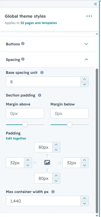
Under Theme settings → Spacing, the spacing unit
(default 8px), container max-width (default 1440px), and section padding all feed tokens like
--spacing-unit, --max-width, and --section-padding-block. Every module in
the theme uses these tokens, so global spacing changes propagate automatically.
7. System Pages
Out-of-the-box system page templates live in templates/system/ and cover the
standard HubSpot flows, styled to match the theme:
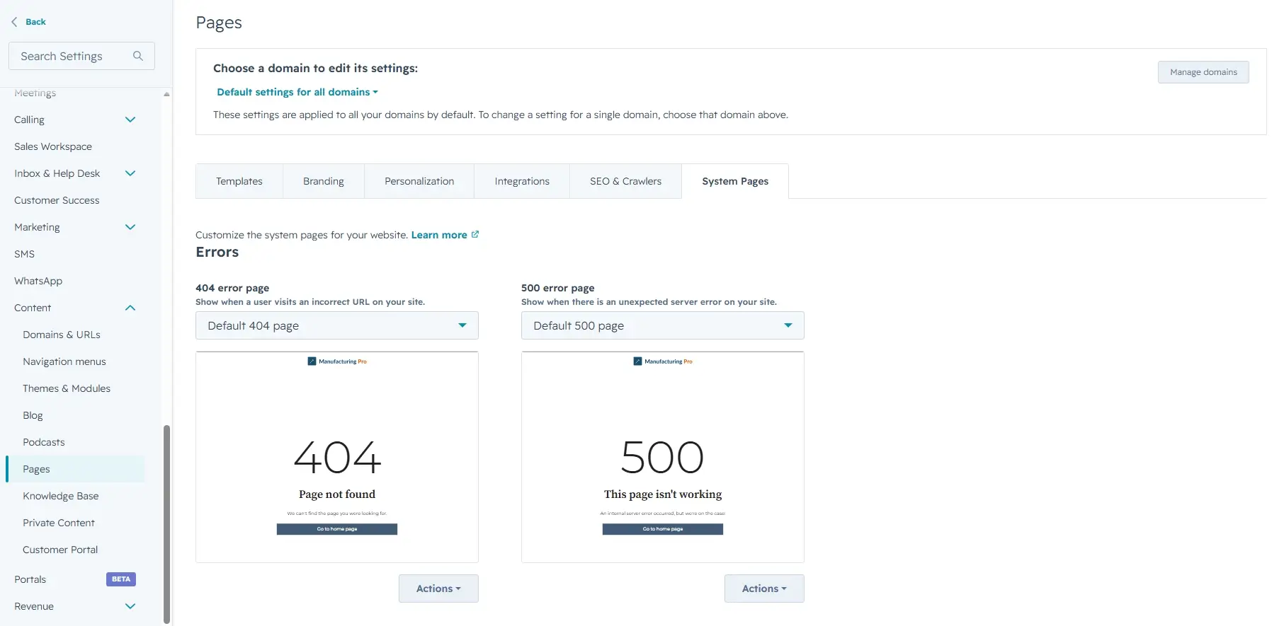
- 404 and 500 error pages
- Password prompt (site access)
- Search results
- Membership: login, register, reset password request & reset
- Subscriptions: confirmation & preferences
- Backup unsubscribe
Assign them in Settings → Tools → Pages → System pages so error and subscription pages match the rest of the site.
8. Quick Reference
| Item | Where to find it |
|---|---|
| Theme settings (colors, fonts, spacing) | Settings → Website → Themes → Edit theme |
| Templates | Design Manager → templates/ |
| Global modules | Design Manager → modules/ (global: true) |
| Section modules | Design Manager → modules/<template>/ |
| Design tokens | css/token.css + theme settings panel |
| Brand overrides | css/theme-overrides.css (loaded last) |
| System pages | templates/system/ + Settings → System pages |