
Team Highlights Slider
HubSpot Module — Setup & Usage Guide
1. Module Location
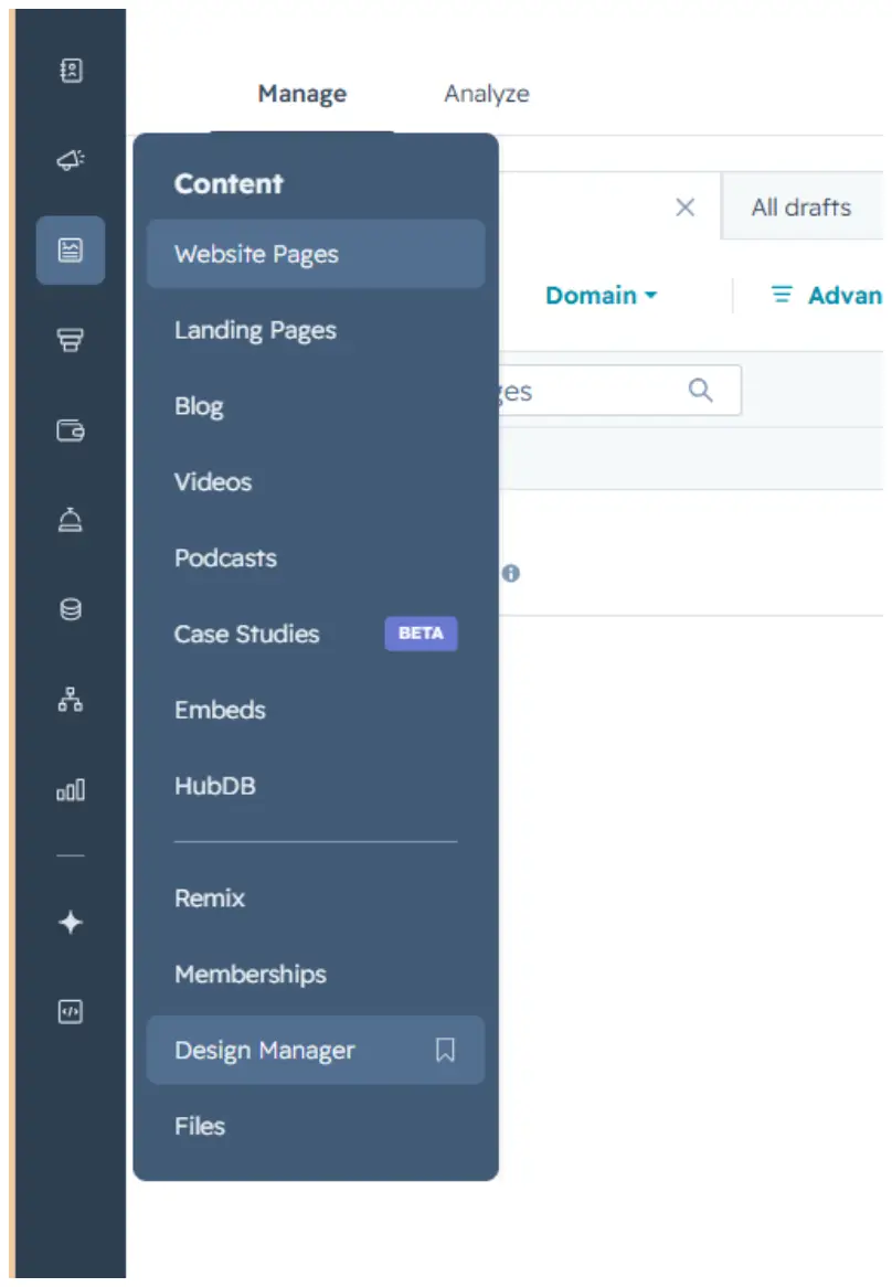
The Team Highlights Slider module is saved in the Design Manager, under Content.
Path: Manage → Content → Design Manager
2. How to Use the Module
Step 1 — Find the module
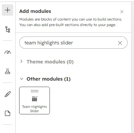
Click the + icon in the page editor to open Add modules, then search for the module name “Team Highlights Slider.”
Step 2 — Add it to the page
Drag the module from the search results panel onto the desired section of the page.
Step 3 — Edit the content
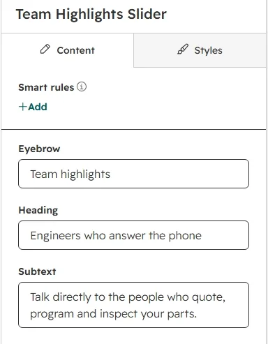
Open the module's Content tab to edit the Eyebrow (“Team highlights”), the Heading (“Engineers who answer the phone”), the Subtext, and the list of Members.
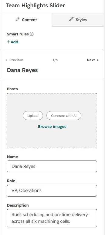
To update an individual member, hover over the item in the Members list and click the pencil icon that appears. Each member has four fields: Photo, Name, Role, and Description. Use the Previous / Next controls at the top to move between items. You can add between 1 and 12 members.
Step 4 — Customize the styling
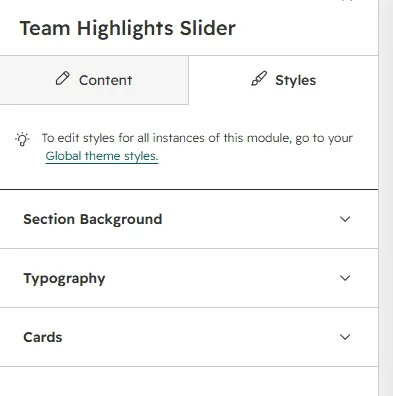
Switch to the Styles tab to adjust the module's appearance. Styling is organized into three collapsible groups: Section Background, Typography, and Cards.
Section Background
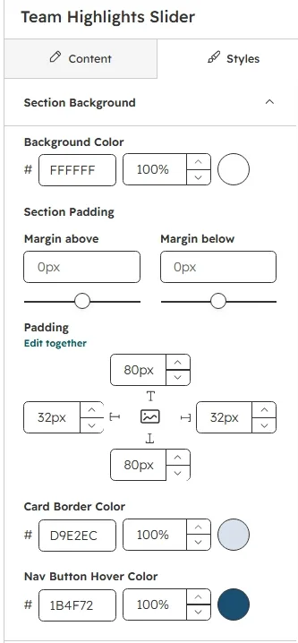
Set the section Background Color, the Section Padding (top / right / bottom / left), the Card Border Color, and the Nav Button Hover Color for the prev/next arrows.
Typography
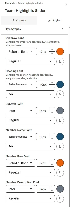
Control font family, size, weight, and color independently for the Eyebrow, the section Heading, the Subtext, the Member Name, the Member Role, and the Member Description.
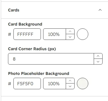
Cards
Customize the member card Background, the Corner Radius (px, 0–40), and the Photo Placeholder Background shown when a member has no photo.
Step 5 — Preview the slider
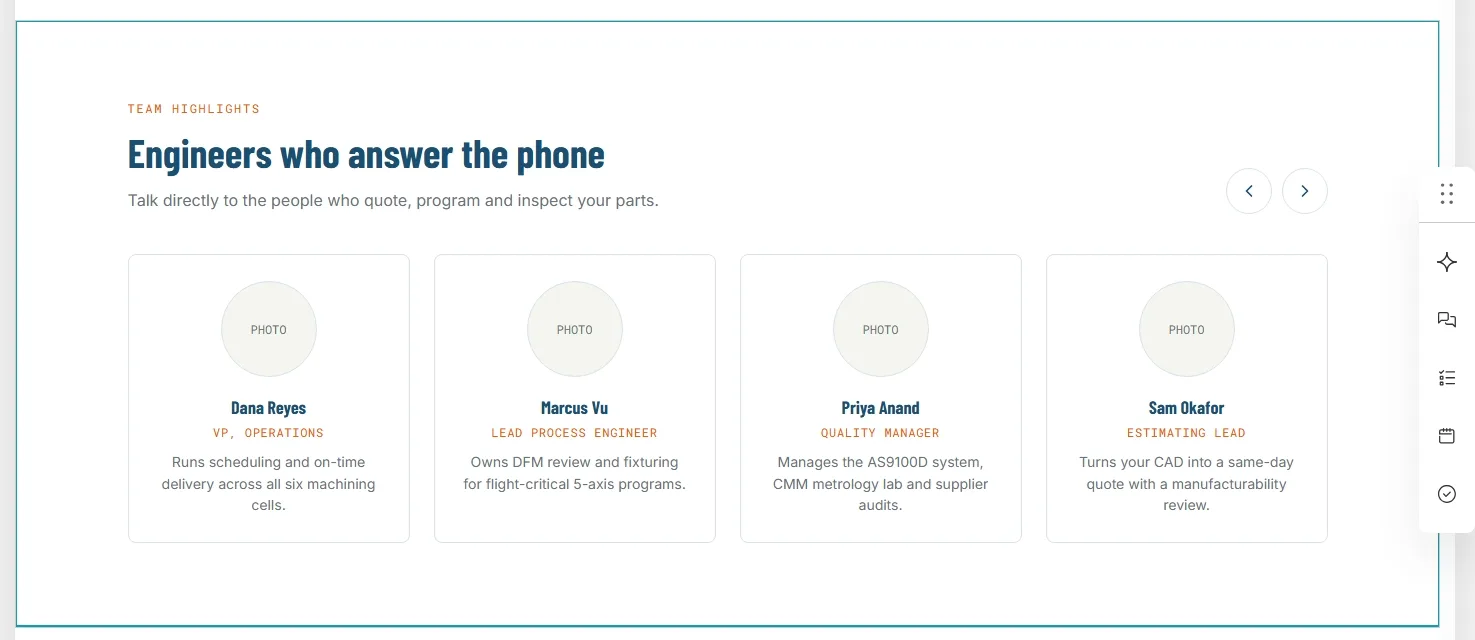
Click Preview to see the finished slider on the page. Use the prev/next arrow buttons to scroll through the member cards, and check the layout on mobile where cards widen to fill most of the viewport.

3. Quick Reference
- Add module: Search “Team Highlights Slider” → drag onto page
- Edit content: Content tab → Eyebrow / Heading / Subtext / Members list
- Edit a single member: hover → pencil icon → Photo / Name / Role / Description
- Member limit: 1–12 items
- Edit styling: Styles tab → Section Background / Typography / Cards
- Slider: prev/next arrows scroll one card per click; layout is responsive down to mobile