
Icon Capability Grid
HubSpot Module — Setup & Usage Guide
1. Module Location
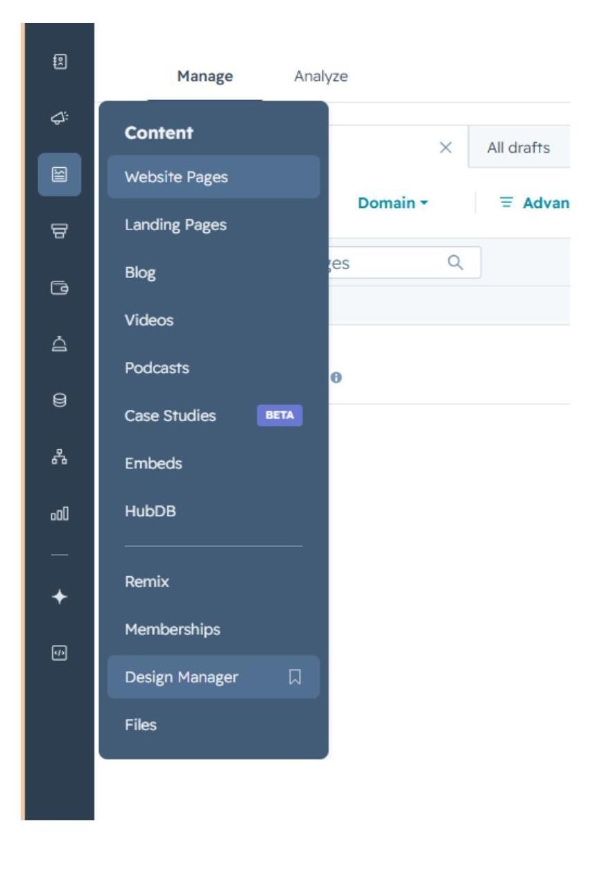
The Icon Capability Grid module is saved in the Design Manager, under Content.
Path: Manage → Content → Design Manager
2. How to Use the Module
Step 1 — Find the module
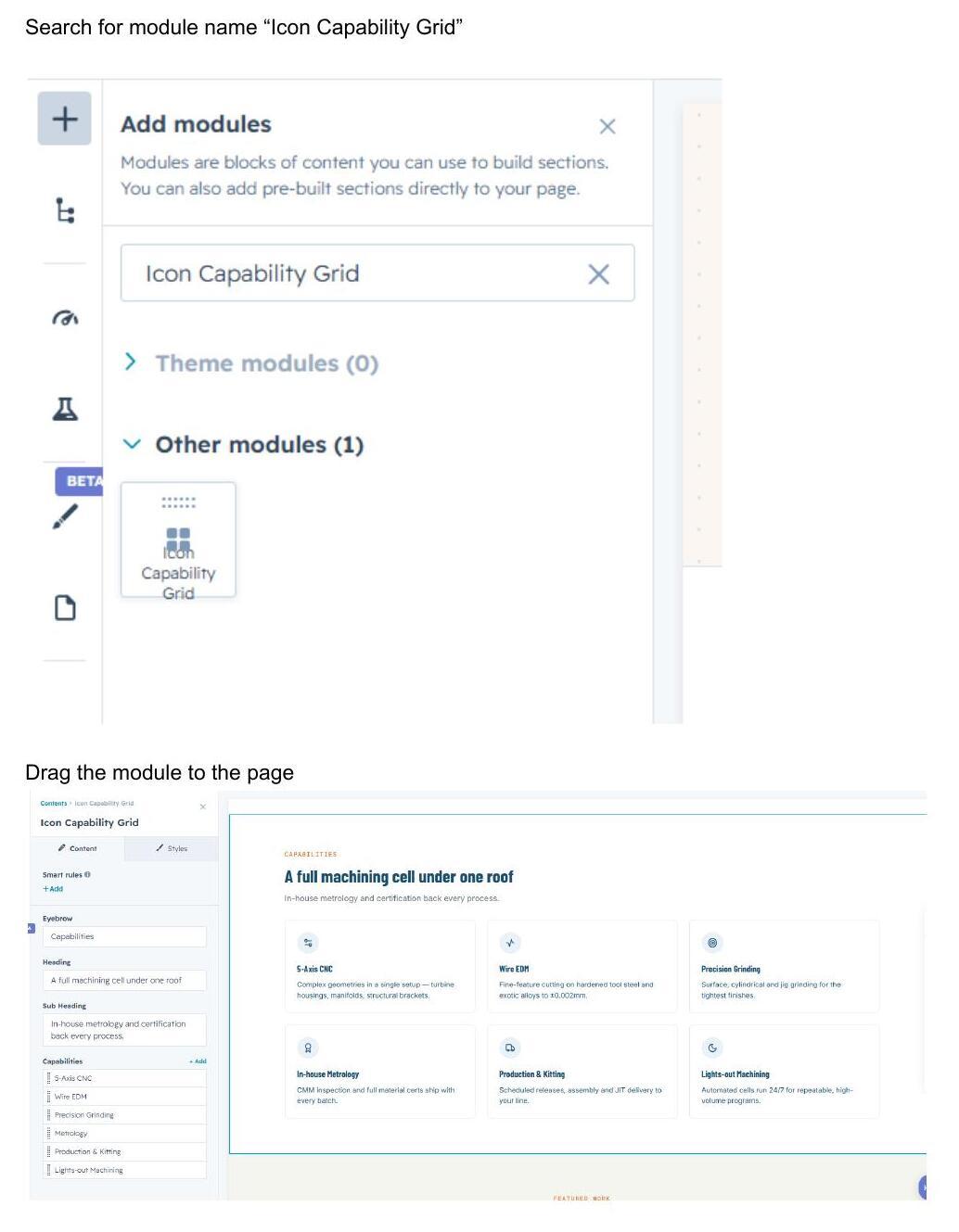
Click the + icon in the page editor to open Add modules, then search for the module name “Icon Capability Grid.”
Step 2 — Add it to the page
Drag the module from the search results panel onto the desired section of the page.
Step 3 — Edit the content
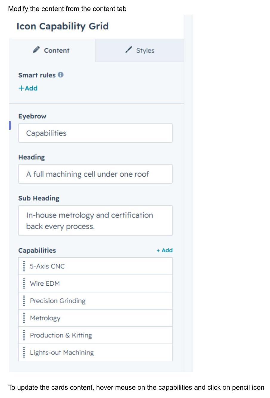
Open the module's Content tab to edit the Eyebrow, Heading, Sub Heading, and the list of Capabilities.
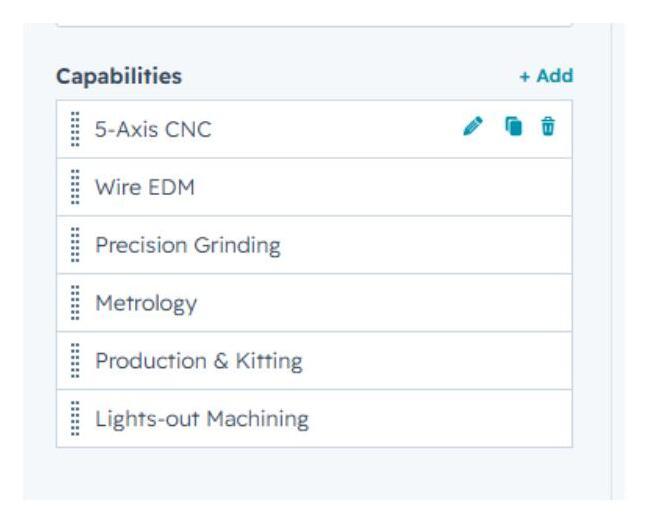
To update an individual capability card, hover over the item in the Capabilities list and click the pencil icon that appears.
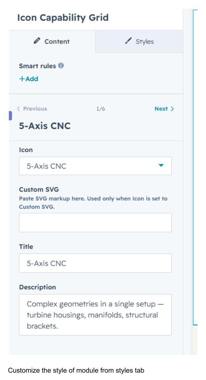
Editing a capability opens a detail panel where you can set its Icon (or paste a Custom SVG), Title, and Description. Use the Previous / Next controls at the top to move between cards.
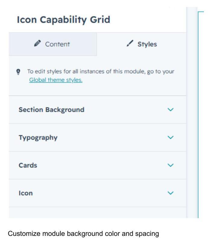
Step 4 — Customize the styling
Switch to the Styles tab to adjust the module's appearance. Styling is organized into four collapsible groups: Section Background, Typography, Cards, and Icon.
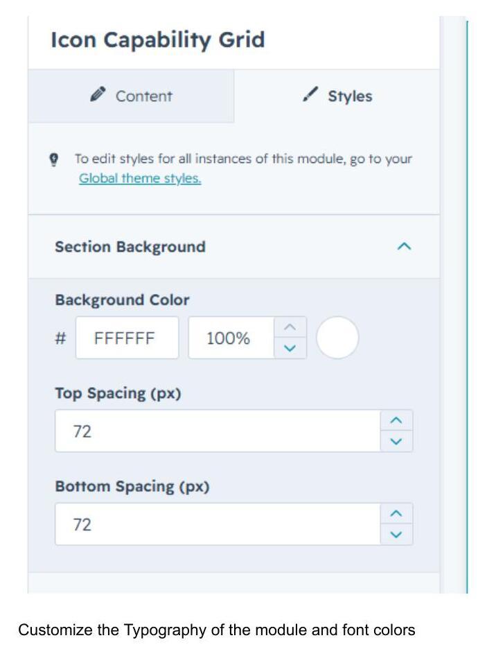
Section Background
Set the background color and the top/bottom spacing (in px) around the module.
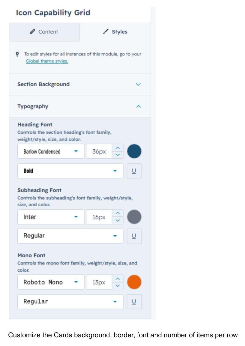
Typography
Control the font family, size, weight, and color independently for the Heading, Subheading, and Mono (eyebrow) text.
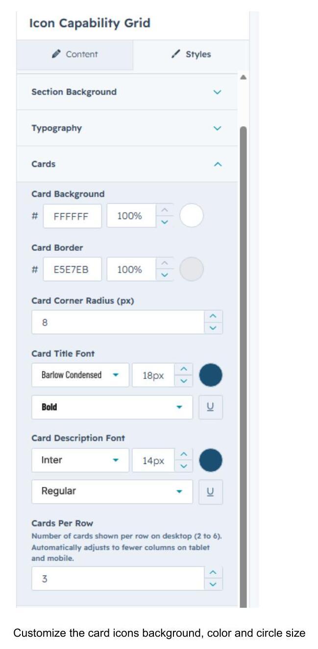
Cards
Customize the card background color, border color, corner radius, title font, description font, and how many cards display per row on desktop (2–6). Layout automatically adapts to fewer columns on tablet and mobile.
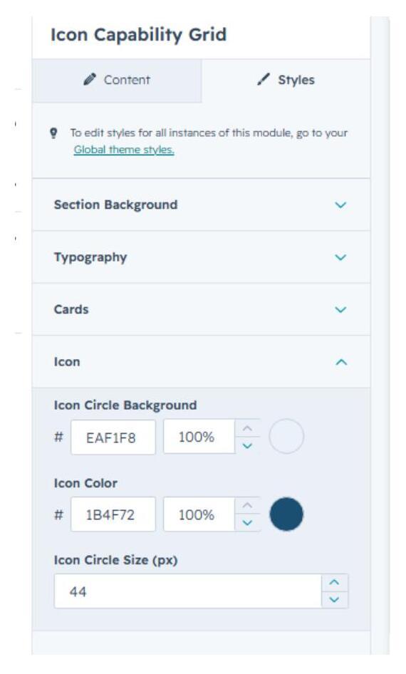
Icon
Set the icon circle's background color, icon color, and circle size (px).
3. Quick Reference
- Add module: Search “Icon Capability Grid” → drag onto page
- Edit content: Content tab → Eyebrow / Heading / Sub Heading / Capabilities list
- Edit a single card: hover → pencil icon → Icon / Title / Description
- Edit styling: Styles tab → Section Background / Typography / Cards / Icon
- Cards per row: adjustable 2–6 (auto-responsive on tablet/mobile)