
Testimonial Slider
HubSpot Module — Setup & Usage Guide
1. Module Location
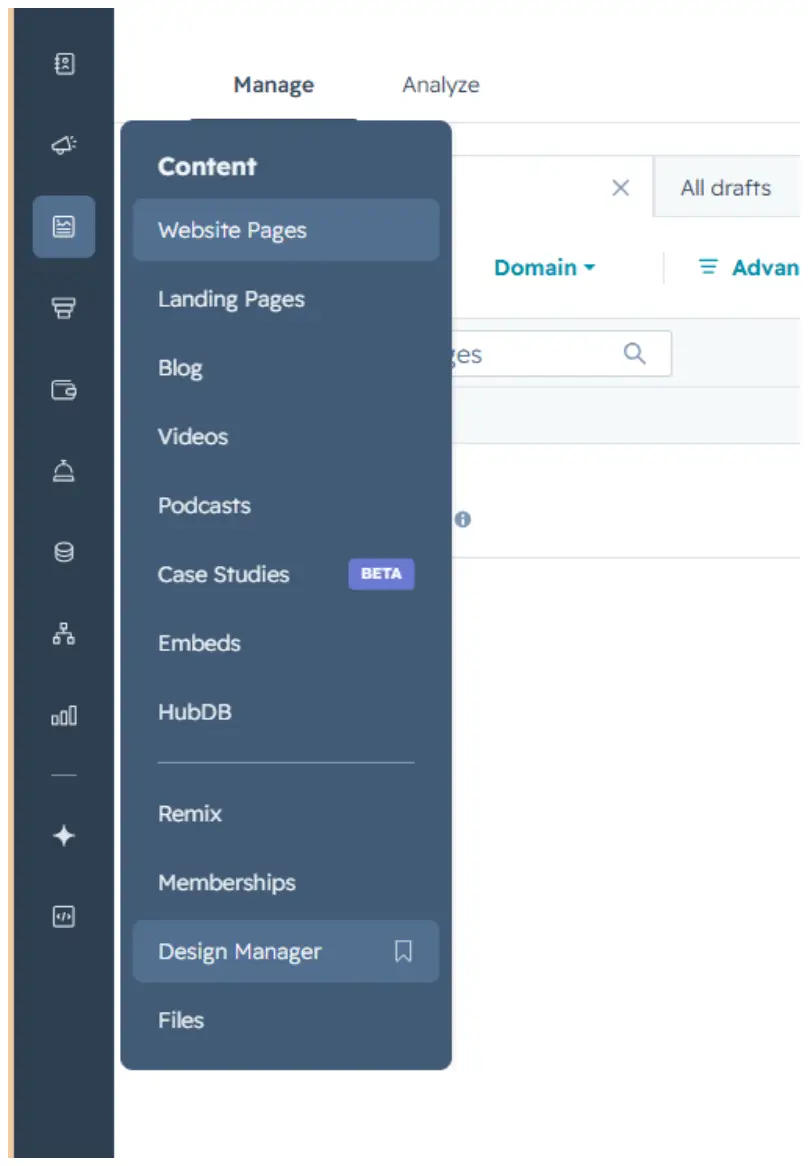
The Testimonial Slider module is saved in the Design Manager, under Content.
Path: Manage → Content → Design Manager
2. How to Use the Module
Step 1 — Find the module
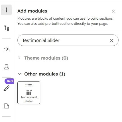
Click the + icon in the page editor to open Add modules, then search for the module name “Testimonial Slider.”
Step 2 — Add it to the page
Drag the module from the search results panel onto the desired section of the page.
Step 3 — Edit the content
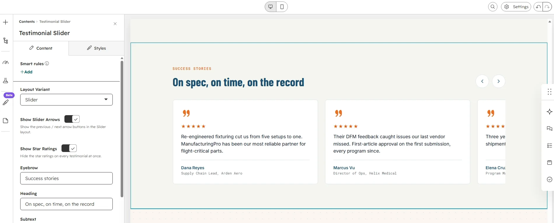
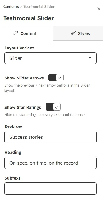
Open the module's Content tab to edit the Eyebrow (“Success stories”), the Heading (“On spec, on time, on the record”), the optional Subtext, and the list of Testimonials. Above the list you will also find the Layout Variant dropdown (Two-column cards vs. Slider) plus two display toggles: Show Slider Arrows and Show Star Ratings (hides stars on every testimonial at once).
To update an individual testimonial, hover over the item in the Testimonials list and click the pencil icon that appears. Each testimonial has five fields: Photo (avatar), Quote, Name, Role, and Star Rating. Use the Previous / Next controls at the top to move between items. You can add between 1 and 12 testimonials.
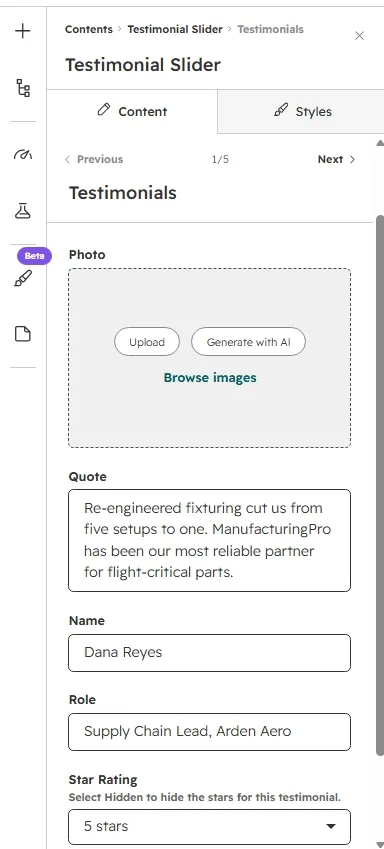
The Star Rating dropdown offers Hidden plus 1–5 stars. Select Hidden to hide the stars for that testimonial only; use the Show Star Ratings toggle above the list to hide them everywhere at once. Leave Photo empty and the card simply shows no avatar.
Step 4 — Customize the styling
Switch to the Styles tab to adjust the module's appearance. Styling is organized into three collapsible groups: Section Background, Typography, and Cards.
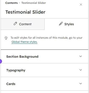
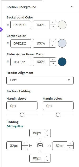
Section Background
Set the section Background Color, the top/bottom Border Color, the Slider Arrow Hover Color for the prev/next buttons, the Header Alignment (Left / Center), and the Top / Bottom Spacing (px, 0–200).
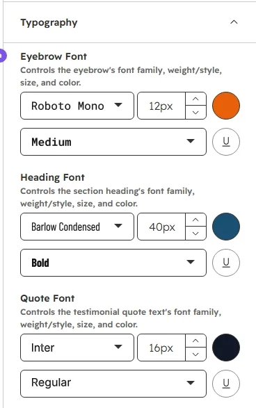
Typography
Control font family, size, weight, and color independently for the Eyebrow, the section Heading, the Subtext, the testimonial Quote, the customer Name, and the Role line.
Cards
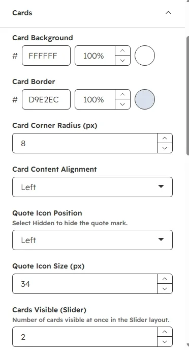
Customize the card Background, Border, and Corner Radius (px, 0–40), plus the Card Content Alignment (Left / Center). Position the decorative Quote Icon (Left / Center / Right / Hidden) and set its Size (px, 16–64). For the Slider layout set how many Cards Visible at once (1–4); for the Two-column cards layout set the Grid Columns (1–3). Then tune the Card Gap (px, 0–60) and Card Padding (px, 0–60).
Avatar controls: Avatar Size (px, 32–96), Avatar Shape (Circle / Square), and Avatar Layout (Stacked — photo above the name — or Inline — photo beside the name). Finish with the Slider Arrow Background / Color, the Star Color, the Stars Position (Below quote icon / Beside quote icon), and the Accent Color (quote mark color).
Step 5 — Preview the module
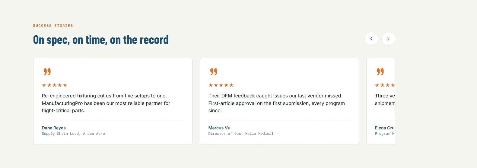
Click Preview to see the finished module on the page. In the Slider layout, use the prev/next arrow buttons to scroll through the testimonial cards (hide them with the Show Slider Arrows toggle); switch Layout Variant to Two-column cards for the static grid. Check the layout on mobile, where slider cards widen to fill most of the viewport and the grid collapses to one column.
3. Quick Reference
- Add module: Search “Testimonial Slider” → drag onto page
- Edit content: Content tab → Eyebrow / Heading / Subtext / Layout Variant / Show Slider Arrows / Show Star Ratings / Testimonials list
- Edit a single testimonial: hover → pencil icon → Photo / Quote / Name / Role / Star Rating
- Testimonial limit: 1–12 items
- Hide stars: per testimonial via Star Rating “Hidden”, or globally via Show Star Ratings toggle
- Edit styling: Styles tab → Section Background / Typography / Cards
- Avatar options: Size 32–96px / Circle or Square / Stacked or Inline; empty Photo = no avatar
- Stars position: Below quote icon or Beside quote icon; Quote icon itself can be Left / Center / Right / Hidden
- Slider: prev/next arrows scroll one card per click; responsive down to mobile (grid collapses to one column)