
Leadership Team Grid
HubSpot Module — Setup & Usage Guide
1. Module Location
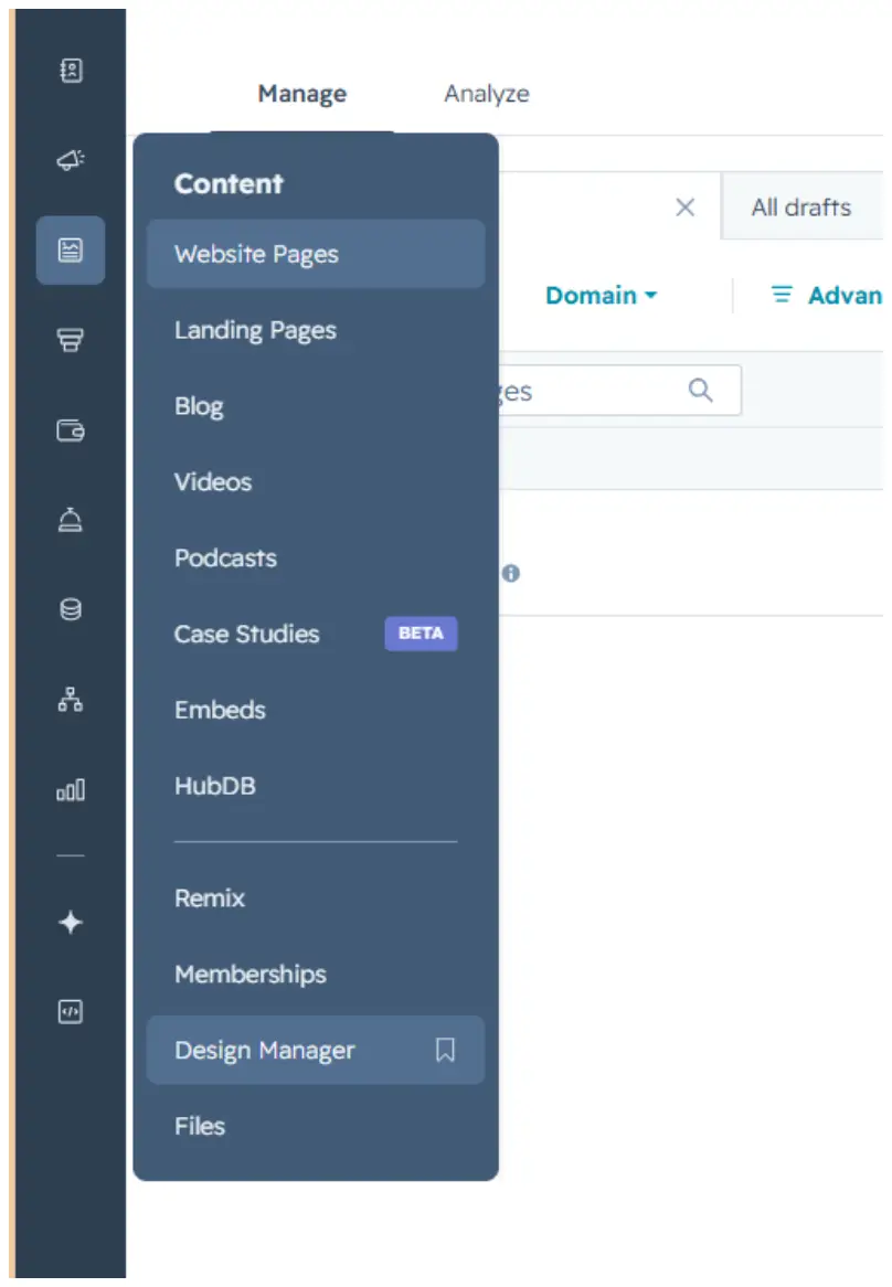
The Leadership Team Grid module is saved in the Design Manager, under Content.
Path: Manage → Content → Design Manager
2. How to Use the Module
Step 1 — Find the module
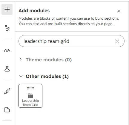
Click the + icon in the page editor to open Add modules, then search for the module name “Leadership Team Grid.”
Step 2 — Add it to the page
Drag the module from the search results panel onto the desired section of the page.
Step 3 — Edit the content
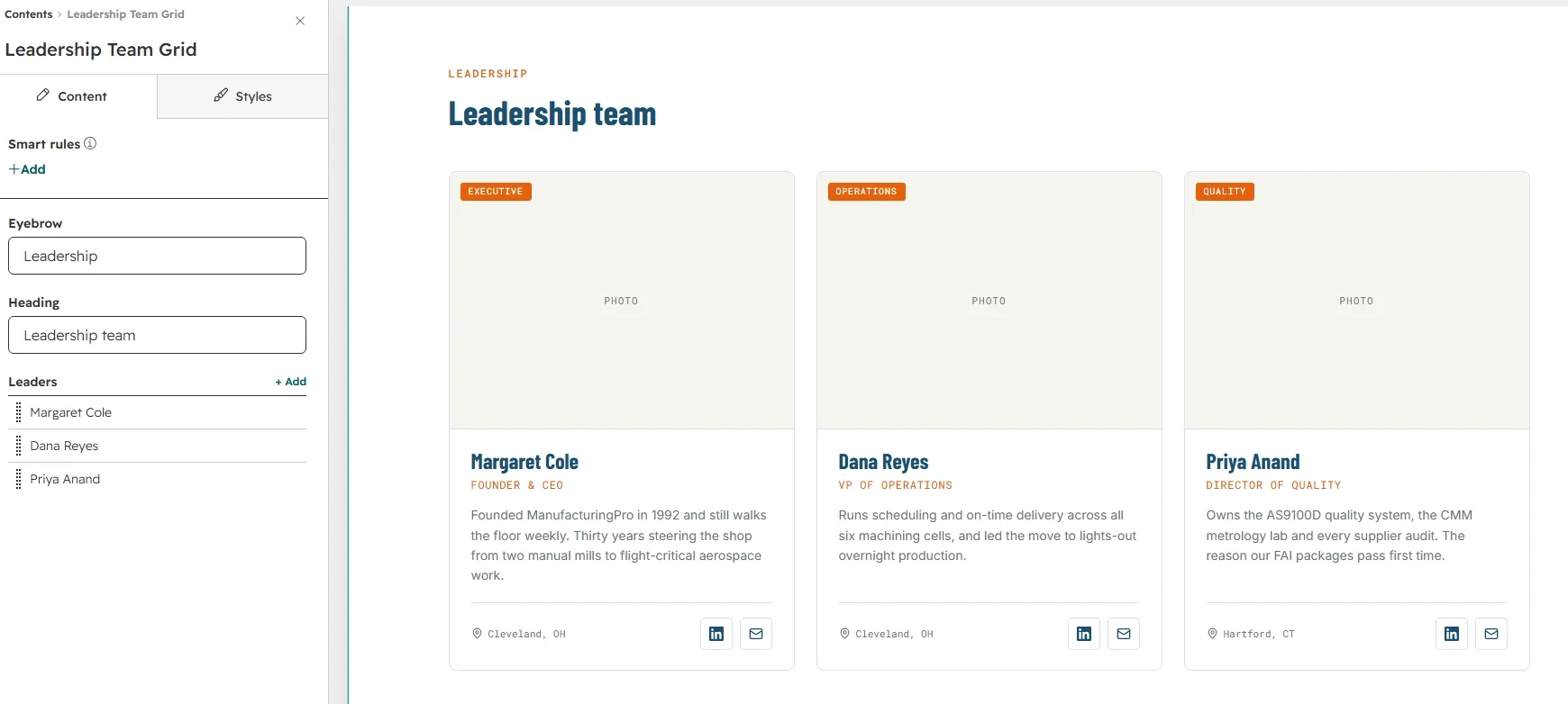
Open the module's Content tab to edit the Eyebrow (“Leadership”), the Heading (“Leadership team”), and the list of Leaders.
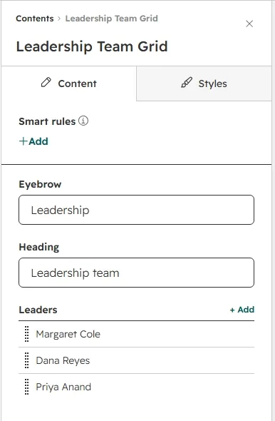
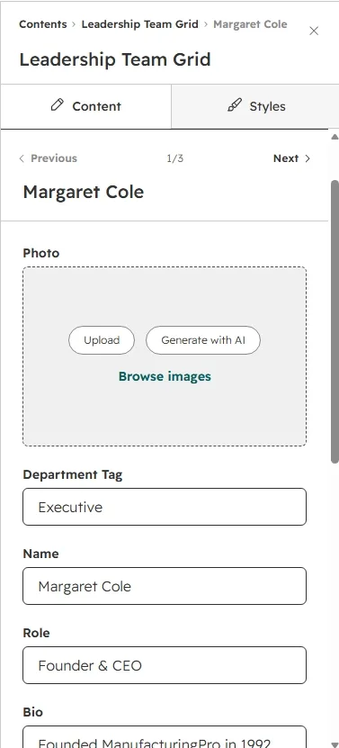
To update an individual leader, hover over the item in the Leaders list and click the pencil icon that appears. Each leader has eight fields: Photo, Department Tag, Name, Role, Bio, Location, LinkedIn URL, and Email URL. Leaving the photo empty shows a PHOTO placeholder, and leaving a URL empty hides that social icon. You can add between 1 and 6 leaders.
Step 4 — Customize the styling
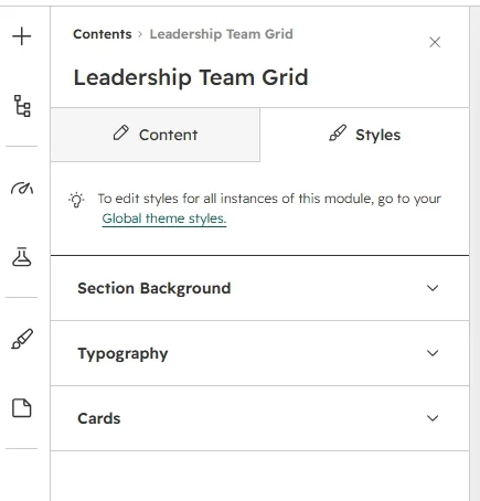
Switch to the Styles tab to adjust the module's appearance. Styling is organized into three collapsible groups: Section Background, Typography, and Cards.
Section Background
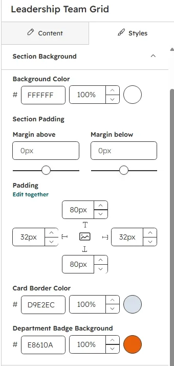
Set the section Background Color, the Section Padding (top / right / bottom / left), the Card Border Color, and the Department Badge Background behind the tag on each photo.
Typography
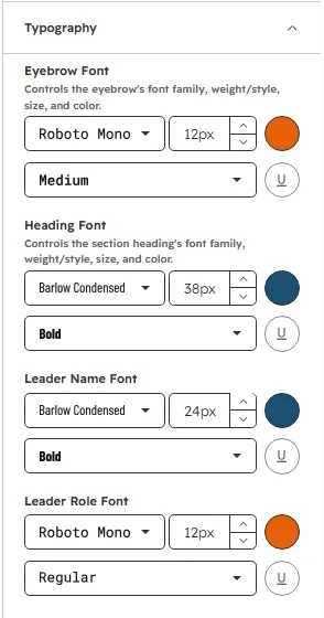
Control font family, size, weight, and color independently for the Eyebrow, the section Heading, the Leader Name, the Leader Role, the Leader Bio, and the Location.
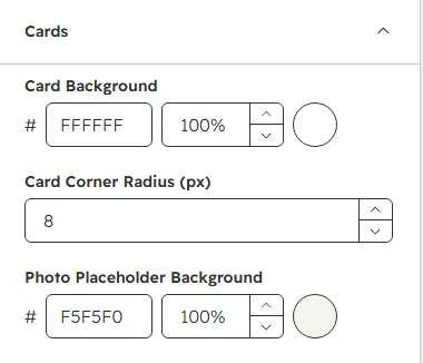
Cards
Customize the leader card Background, the Corner Radius (px, 0–40), and the Photo Placeholder Background shown when a leader has no photo.
Step 5 — Preview the grid
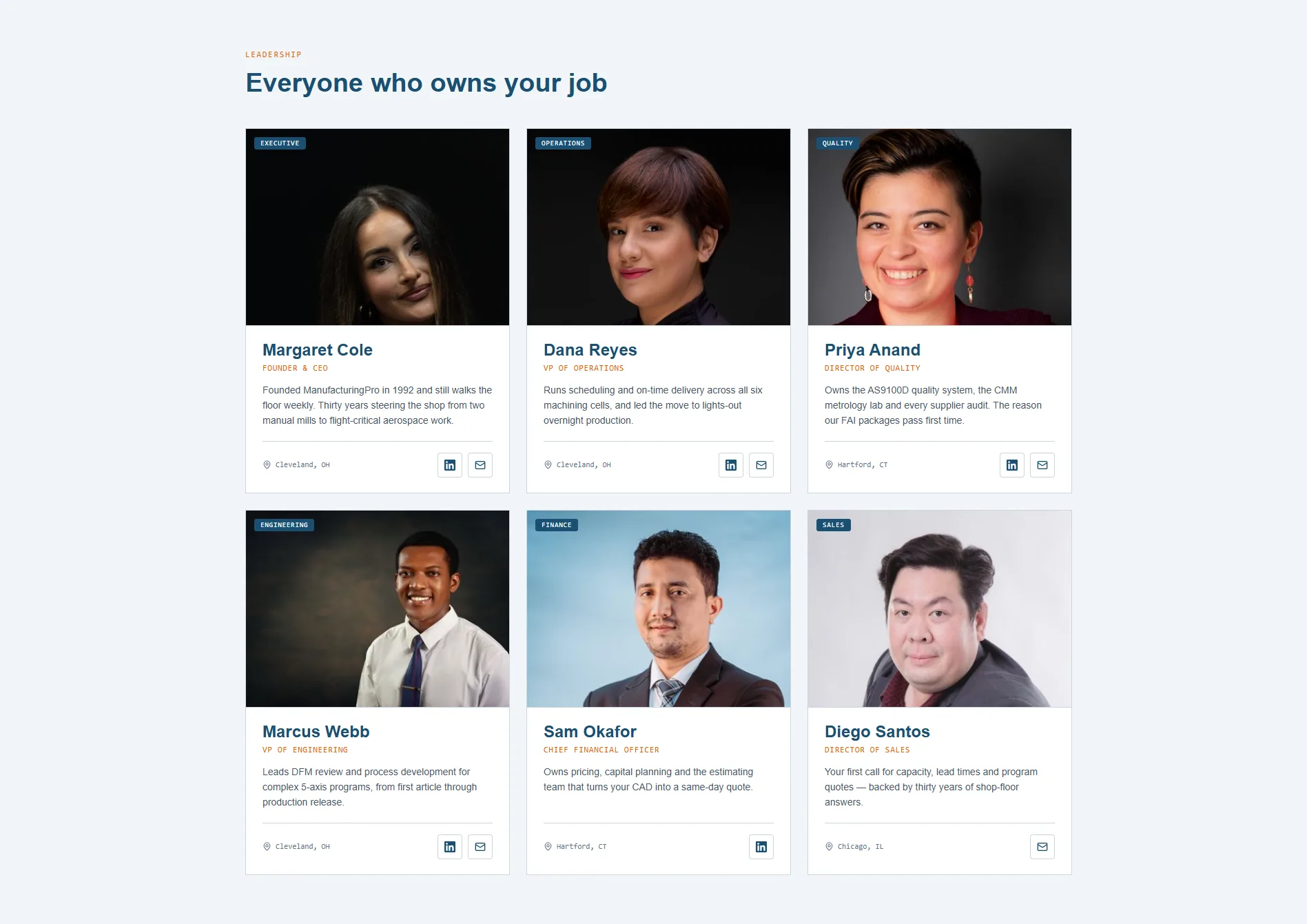
Click Preview to see the finished grid on the page. Hover a card to see the lift effect, and check the layout on tablet and mobile where the grid collapses from three columns to two, then one.
3. Quick Reference
- Add module: Search “Leadership Team Grid” → drag onto page
- Edit content: Content tab → Eyebrow / Heading / Leaders list
- Edit a single leader: hover → pencil icon → Photo / Department Tag / Name / Role / Bio / Location / LinkedIn URL / Email URL
- Leader limit: 1–6 items
- Photo fallback: empty photo shows a PHOTO placeholder; empty URLs hide the social icons
- Edit styling: Styles tab → Section Background / Typography / Cards
- Layout: 3-column grid, responsive down to a single column on mobile