Hero Banner with Dynamic Cards
HubSpot Module Guide — Setup, Content & Styling
This guide covers the Hero Banner with Dynamic Cards module in HubSpot: where it lives in Design Manager, how to add it to a page, how to edit its content, and how to restyle it to match a brand. It is organized in three parts — location, content editing, and styling.
1. Where the Module Is Saved
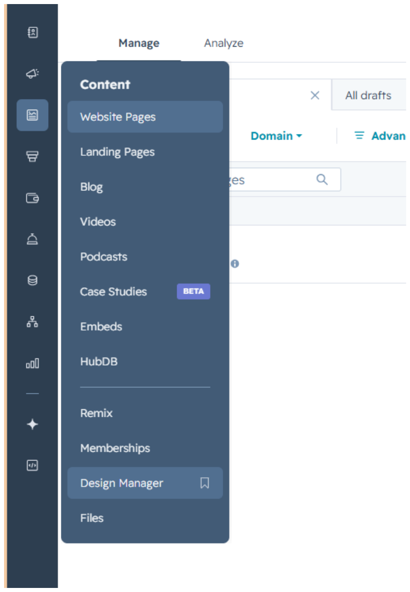
To find it, open the Content menu in the left sidebar and select Design Manager.
2. Adding the Module to a Page
2.1 Search for the module
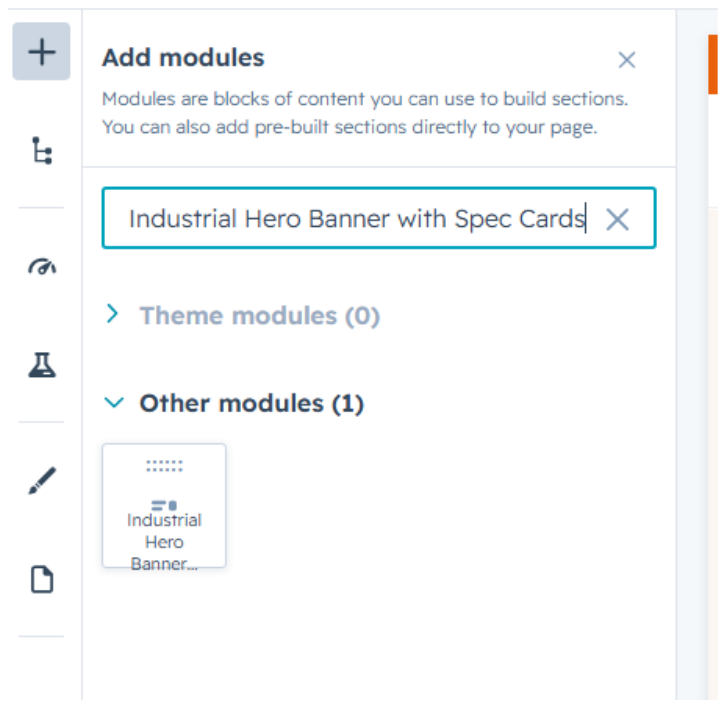
From the page editor, open Add modules and search for the module by name:
“Hero Banner with Dynamic Cards”
2.2 Drag it onto the page
Drag the module from the search results into the page canvas. It will render with its default placeholder content, ready to edit.
3. Editing Content
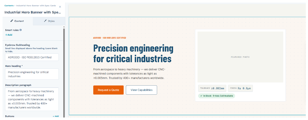
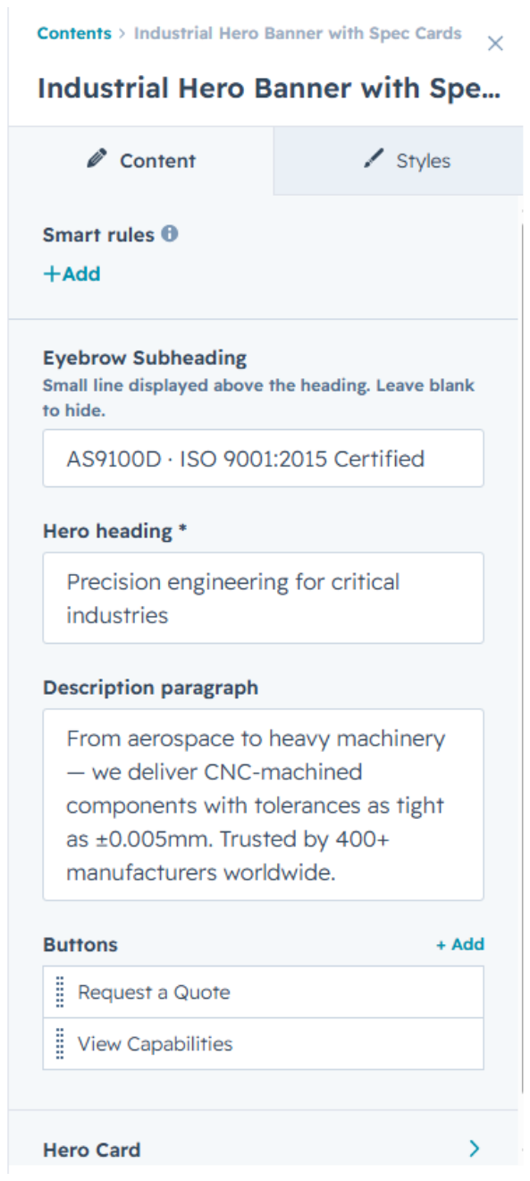
All content fields live under the Content tab of the module editor.
3.1 Hero text and buttons
- Eyebrow Subheading — the small line above the heading. Leave blank to hide it.
- Hero heading — the main title (required).
- Description paragraph — supporting copy under the heading.
3.2 Creating or updating a button
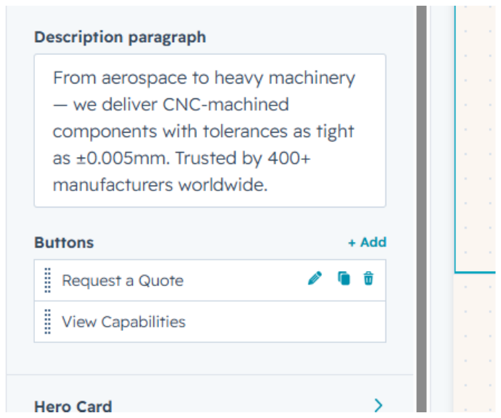
Hover over a button in the list and click the pencil icon to edit it.
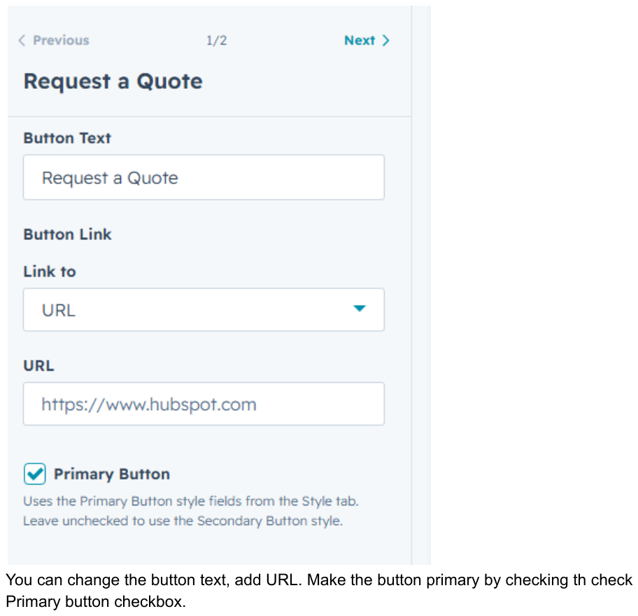
In the editor, set the button text, the destination URL, and whether it should use the Primary style (checkbox) or fall back to the Secondary style.
3.3 Hero Card
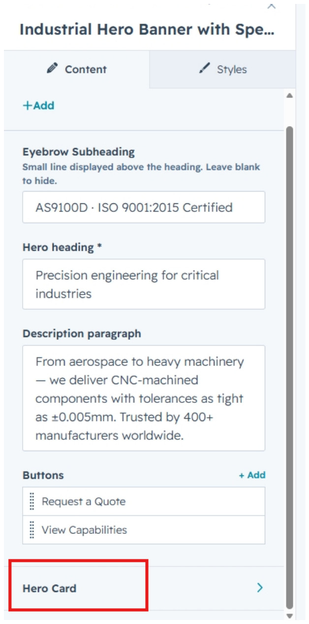
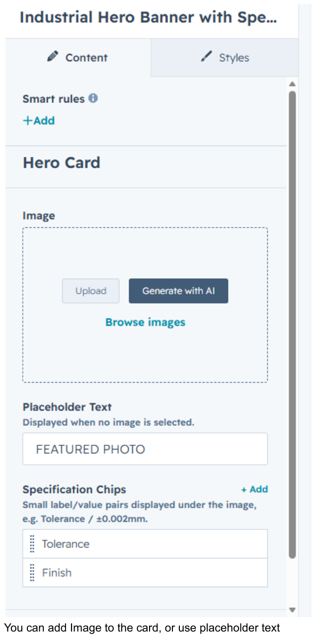
Open the Hero Card section from the Content tab to edit the image, placeholder text, and specification chips.
Add an image directly, or leave it blank and the Placeholder Text will display instead. Specification chips are the small label/value pairs shown under the image.
3.4 Editing a specification chip
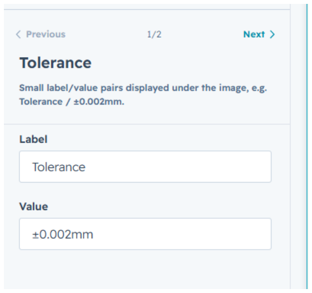
Click any chip in the list to set its label and value, for example “Tolerance” and “±0.002mm”.
3.5 Badge
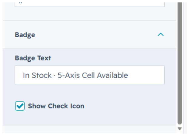
Click the Badge group to set the badge text and optionally show a check icon next to it.
4. Styling the Module
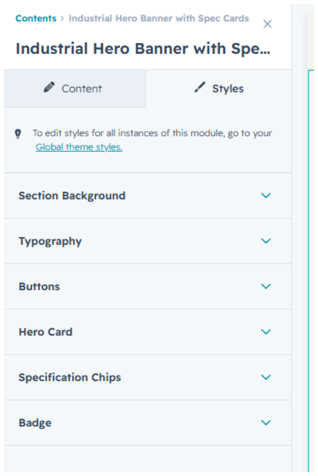
Every element in the module has its own styling controls under the Styles tab, so the banner can be adapted to match a brand without touching the content.
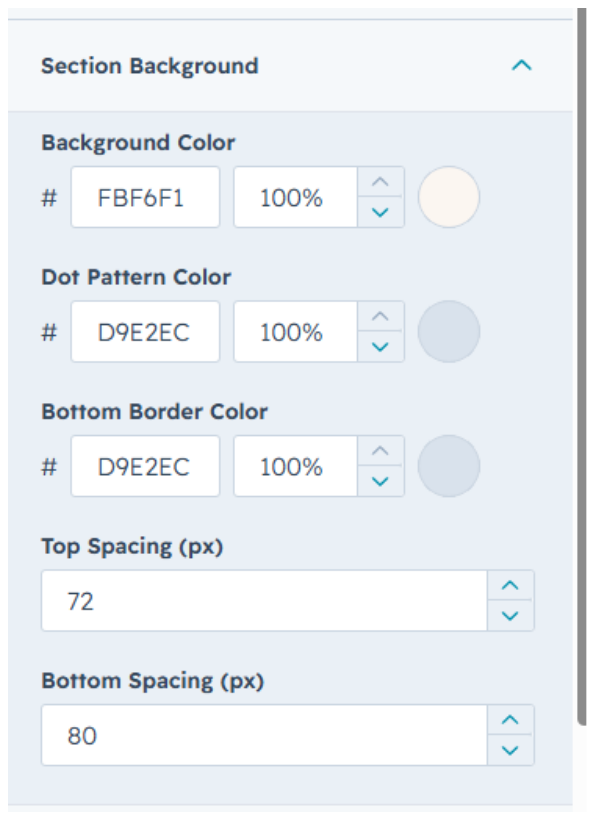
4.1 Section Background
| Field | Default value |
|---|---|
| Background Color | #FBF6F1 |
| Dot Pattern Color | #D9E2EC |
| Bottom Border Color | #D9E2EC |
| Top Spacing | 72px |
| Bottom Spacing | 80px |
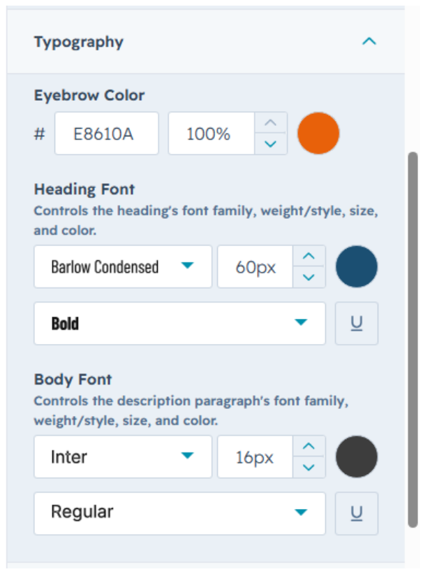
4.2 Typography
| Field | Default value |
|---|---|
| Eyebrow Color | #E8610A |
| Heading Font | Barlow Condensed, Bold, 60px |
| Body Font | Inter, Regular, 16px |
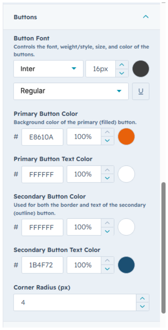
4.3 Buttons
| Field | Default value |
|---|---|
| Button Font | Inter, Regular, 16px |
| Primary Button Color | #E8610A |
| Primary Button Text Color | #FFFFFF |
| Secondary Button Color | #FFFFFF |
| Secondary Button Text Color | #1B4F72 |
| Corner Radius | 4px |
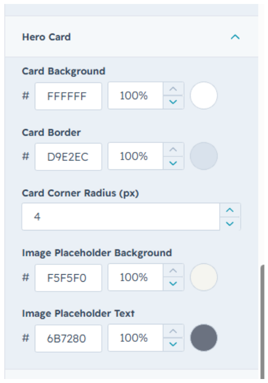
4.4 Hero Card
| Field | Default value |
|---|---|
| Card Background | #FFFFFF |
| Card Border | #D9E2EC |
| Card Corner Radius | 4px |
| Image Placeholder Background | #F5F5F0 |
| Image Placeholder Text | #6B7280 |
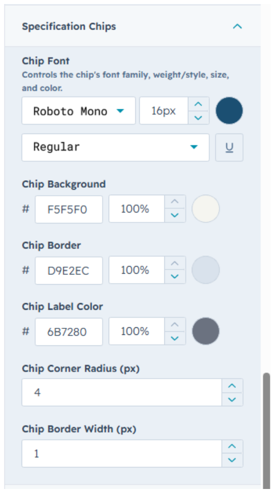
4.5 Specification Chips
| Field | Default value |
|---|---|
| Chip Font | Roboto Mono, Regular, 16px |
| Chip Background | #F5F5F0 |
| Chip Border | #D9E2EC |
| Chip Label Color | #6B7280 |
| Chip Corner Radius | 4px |
| Chip Border Width | 1px |
4.6 Badge
| Field | Default value |
|---|---|
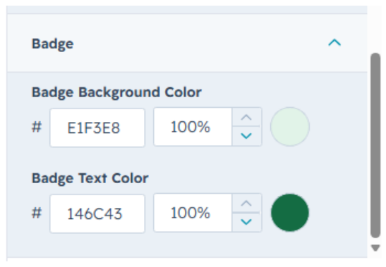
| Badge Background Color | #E1F3E8 |
| Badge Text Color | #146C43 |