
Dynamic Page Header
HubSpot Module — Setup & Usage Guide
1. Module Location
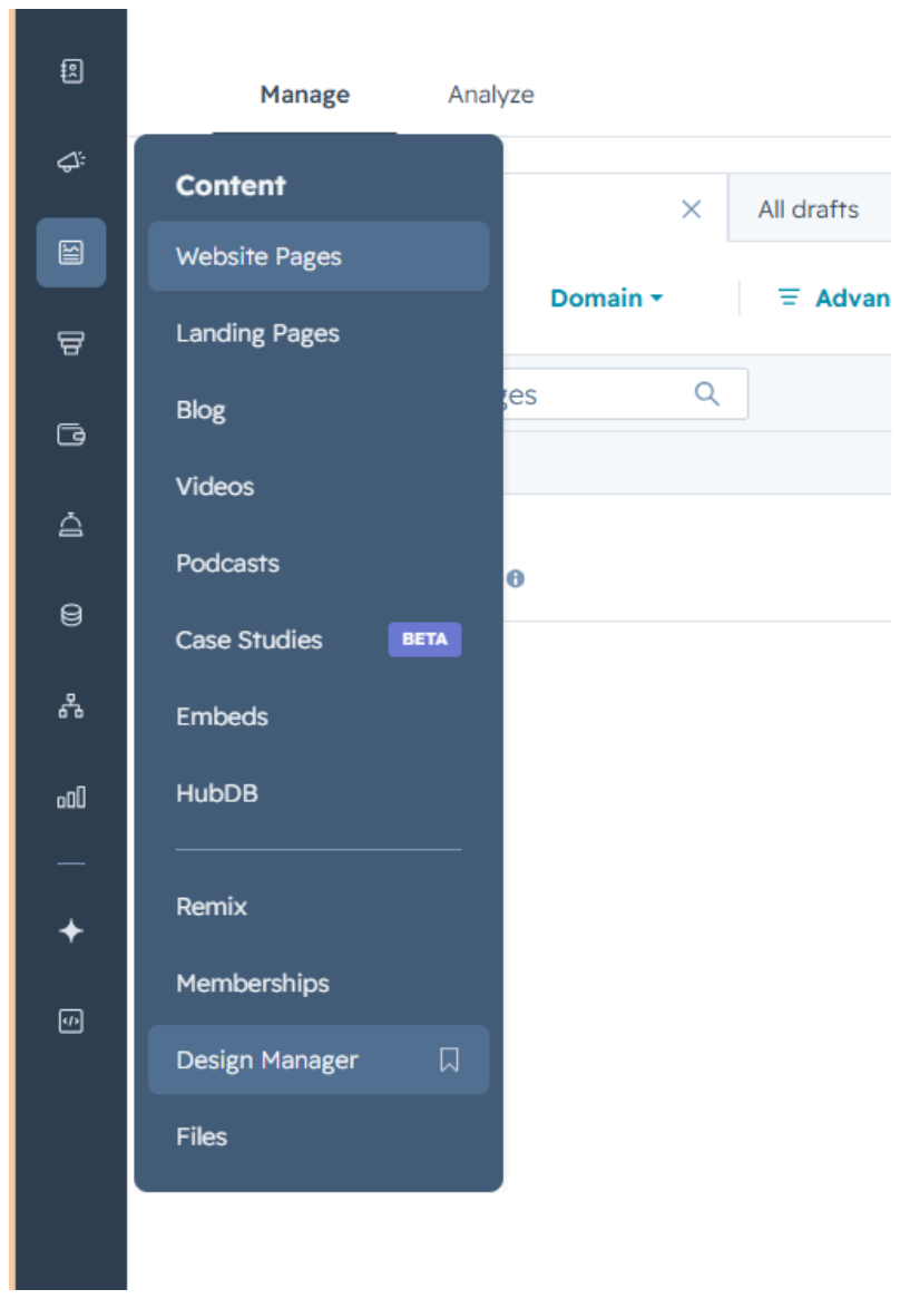
The Dynamic Page Header module is saved in the Design Manager, under Content.
Path: Manage → Content → Design Manager
2. How to Use the Module
Step 1 — Find the module
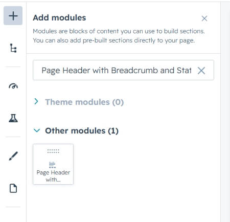
Click the + icon in the page editor to open Add modules, then search for the module name “Dynamic Page Header.”
Step 2 — Add it to the page
Drag the module from the search results panel onto the desired section of the page.
Step 3 — Edit the content
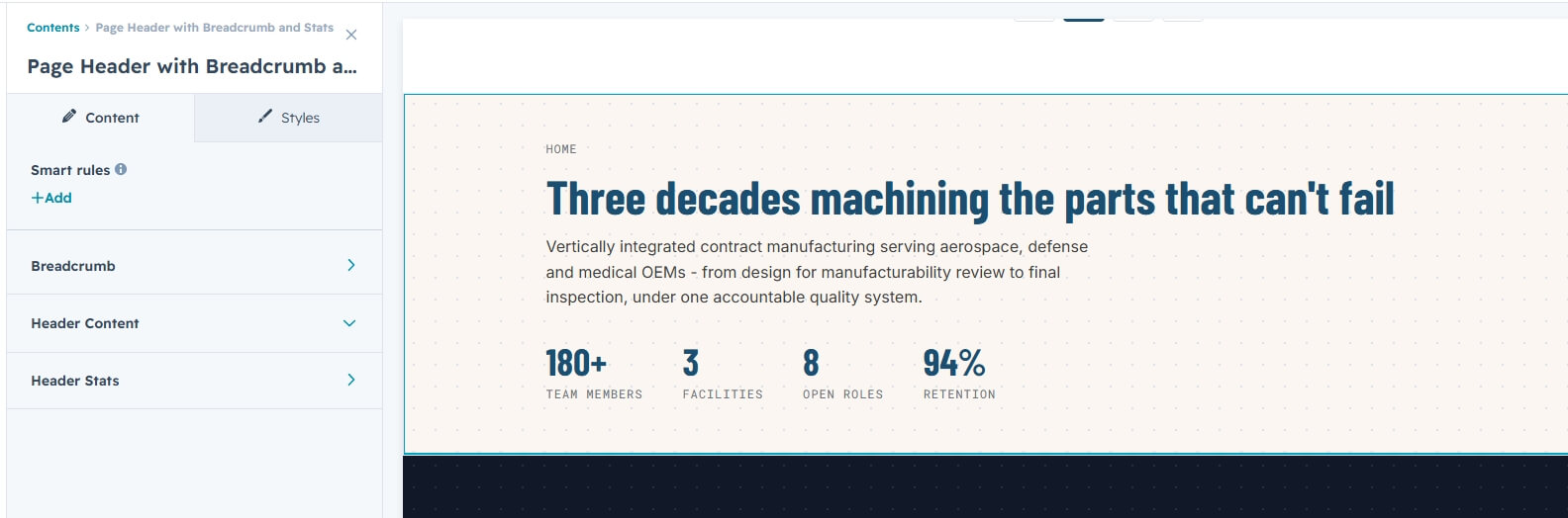
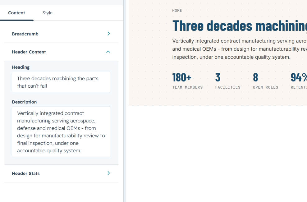
Open the module's Content tab. Content is organized into three collapsible groups: Breadcrumb, Header Content, and Header Stats.
Breadcrumb
Use the Show Breadcrumb toggle to show or hide the breadcrumb trail. When enabled, the Parent Breadcrumbs list appears — add one item per parent page, each with a Label and a URL.
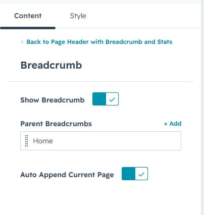
With Auto Append Current Page enabled, the page's own name is added automatically at the end of the trail.
Header Content
Set the page Heading and the Description paragraph shown under it.
Header Stats
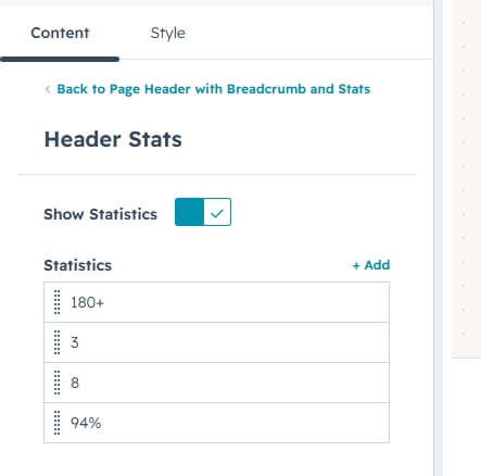
Use the Show Statistics toggle to show or hide the stats row. When enabled, the Statistics list appears — add one item per stat, each with a Value (e.g. “180+”) and a Label (e.g. “Team members”).
Step 4 — Customize the styling
Switch to the Styles tab to adjust the module's appearance. Styling is organized into two collapsible groups: Section Background and Typography.
Section Background
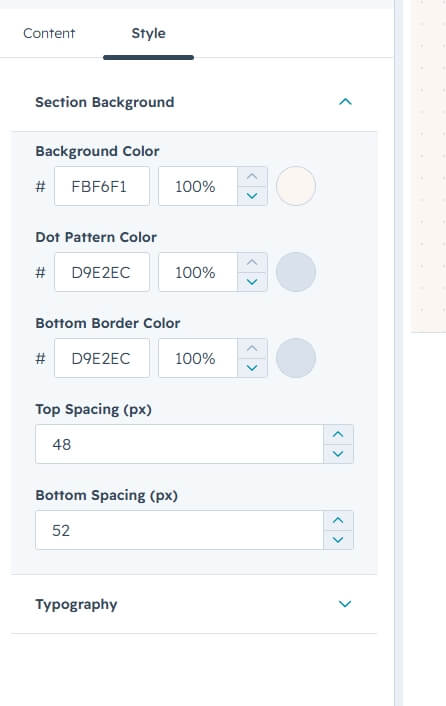
Set the background color, the Dot Pattern color (the dotted texture behind the content), the Bottom Border color, and the Top / Bottom Spacing (in px, 0–200) around the section.
Typography
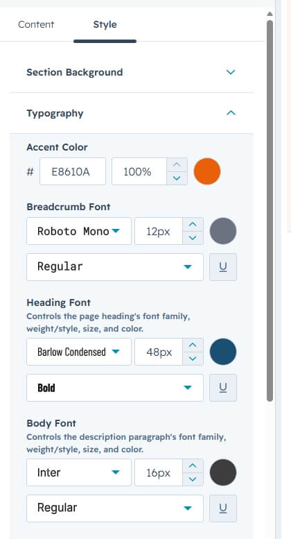
Control font family, size, weight, and color independently for the Breadcrumb, Heading, Body (description), Stat Value, and Stat Label text. The Accent Color styles hovered breadcrumb links and the current page's name.
3. Quick Reference
- Add module: Search “Dynamic Page Header” → drag onto page
- Edit content: Content tab → Breadcrumb / Header Content / Header Stats
- Breadcrumb items: Show Breadcrumb toggle → Parent Breadcrumbs (Label + URL), plus Auto Append Current Page
- Stats items: Show Statistics toggle → Statistics (Value + Label)
- Edit styling: Styles tab → Section Background / Typography
- Typography: independent fonts for Breadcrumb, Heading, Body, Stat Value, Stat Label