
FAQ Accordion
HubSpot Module — Setup & Usage Guide
1. Module Location
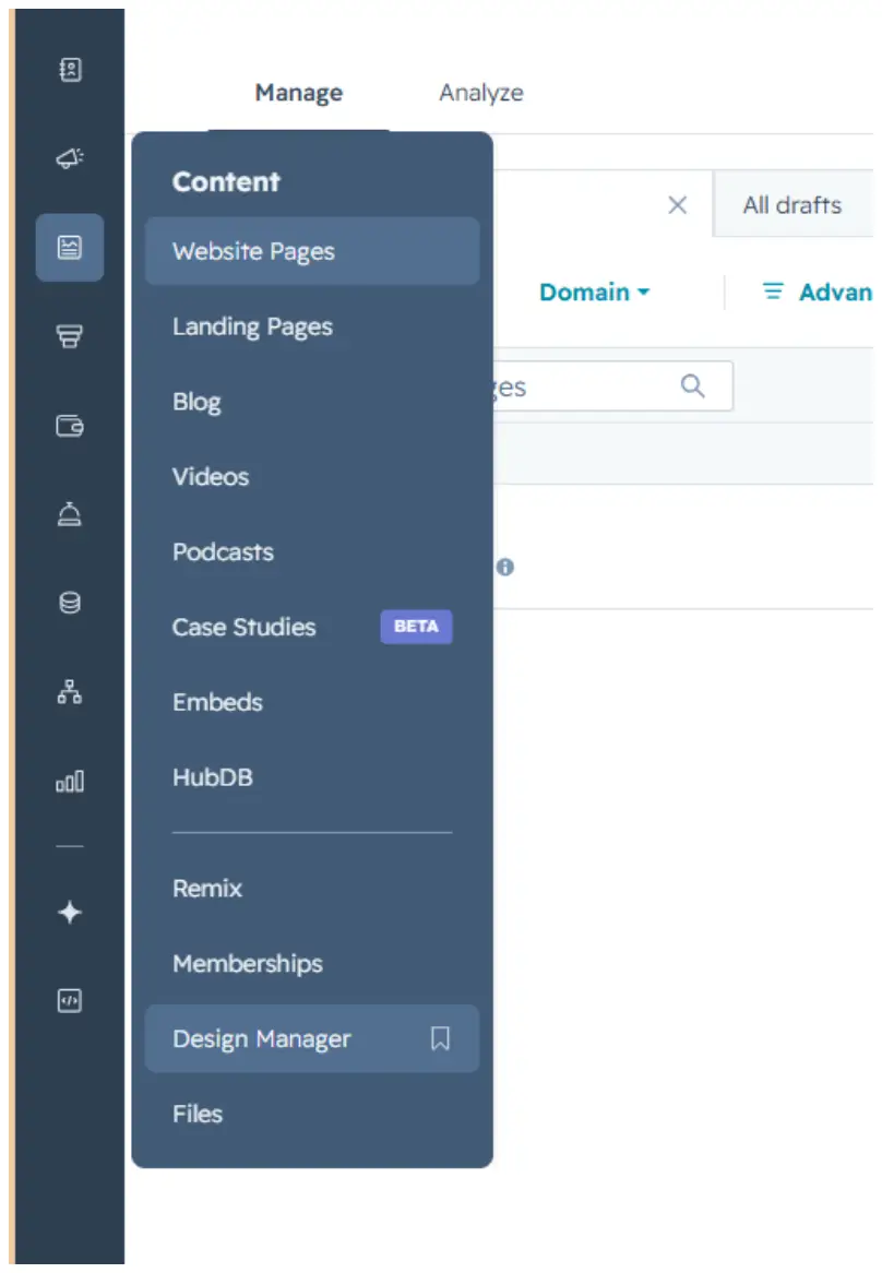
The FAQ Accordion module is saved in the Design Manager, under Content.
Path: Manage → Content → Design Manager
2. How to Use the Module
Step 1 — Find the module
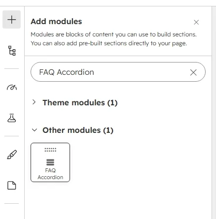
Click the + icon in the page editor to open Add modules, then search for the module name “FAQ Accordion.”
Step 2 — Add it to the page
Drag the module from the search results panel onto the desired section of the page.
Step 3 — Edit the content
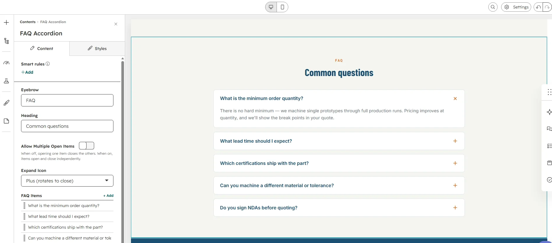
Open the module's Content tab to edit the Eyebrow (default “FAQ”), Heading (default “Common questions”), Allow Multiple Open Items toggle, Expand Icon selector, and the FAQ Items repeater.
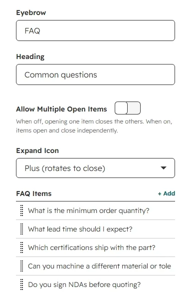
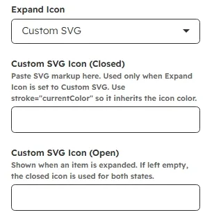
When Allow Multiple Open Items is off, opening one item closes the others. When on, items open and close independently. The Expand Icon selector offers Plus (rotates to ×), Plus / Minus (glyph swap), Chevron, Arrow, Caret (rotate 180°), and Custom SVG. The two Custom SVG fields appear only when Custom SVG is selected — paste markup with stroke=“currentColor” so it inherits the icon color. The open-state SVG is optional: if empty, the closed icon is used for both states.
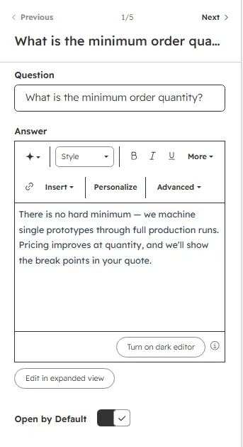
To update an individual FAQ, hover over the item in the FAQ Items list and click the pencil icon that appears. Each item has three fields: Question, Answer (rich text), and Open by Default. The first item ships with Open by Default on. You can add 1–10 items (default 5).
Step 4 — Customize the styling
Switch to the Styles tab to adjust the module's appearance. Styling is organized into three collapsible groups: Section Background, Typography, and Accordion Items.
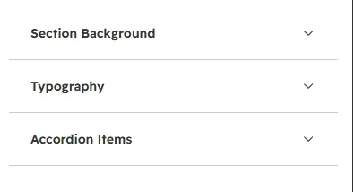
Section Background
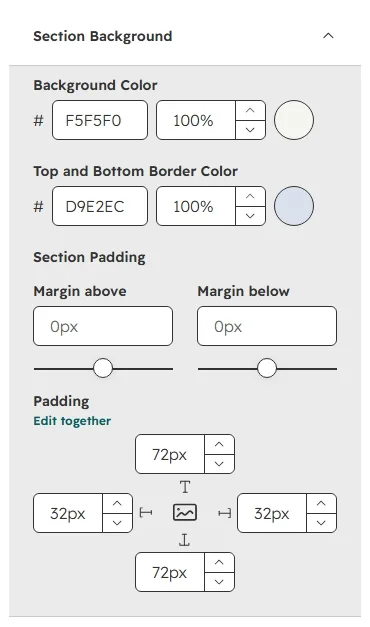
Set the section Background Color (default #F5F5F0), the Top and Bottom Border Color (default #D9E2EC), and the Section Padding (default 72px top / 32px sides / 72px bottom).
Typography
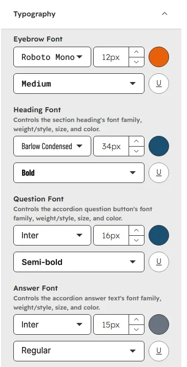
Control the font family, size, weight, and color for the Eyebrow (Roboto Mono 500 12px #E8610A), section Heading (Barlow Condensed 700 34px #1B4F72), Question (Inter 600 16px #1B4F72), and Answer (Inter 400 15px #6B7280) text independently.
Accordion Items
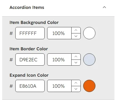
Set the Item Background Color (default #FFFFFF), Item Border Color (default #D9E2EC), and Expand Icon Color (default #E8610A).
3. Quick Reference
- Add module: Search “FAQ Accordion” → drag onto page
- Edit content: Content tab → Eyebrow / Heading / Allow Multiple Open Items / Expand Icon / FAQ Items
- Edit a single FAQ: hover → pencil icon → Question / Answer / Open by Default
- FAQ limit: 1–10 items (default 5, first open)
- Icons: Plus / Plus-Minus / Chevron / Arrow / Caret / Custom SVG (closed + optional open)
- Edit styling: Styles tab → Section Background / Typography / Accordion Items