
Contact Form with Quick Info Rail
Setup Guide
A two-column module that pairs a HubSpot form with a quick info rail containing contact cards and a note card. The form section displays a heading, sub-text, and the selected HubSpot form. The rail shows repeatable contact items (phone, email, location) with an optional closing note card.
1. Module Location
This module is designed for Contact Us and Quote Request pages. It typically sits below a page header section and above an office locations or map section.
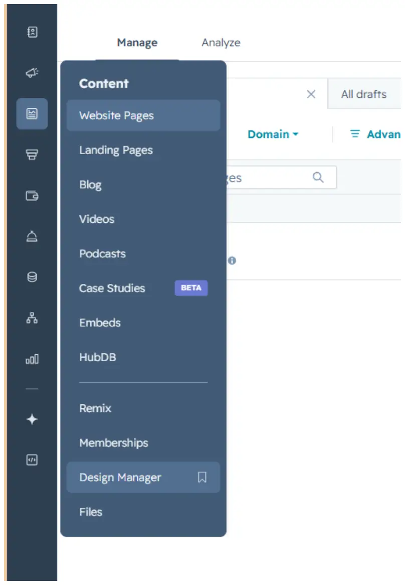
Figure 1 — The module renders as a two-column grid: form on the left, info rail on the right.
2. How to Use
Step 1: Add the module to your page
In the HubSpot page editor, drag the Contact Form with Quick Info Rail module into your content area. It will appear with the default configuration.
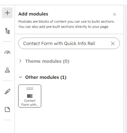
Figure 2 — Dragging the module from the sidebar into the page layout.
Step 2: Configure the form section
Under the Form Section group in the content tab:
- Heading — The form card title (e.g., "Send us your inquiry").
- Sub-text — Descriptive text below the heading. Use this to explain what the form is for.
- HubSpot Form — Select a form you've created in Marketing > Forms. The form renders inline (v4) inside the card.
- Footer Note — Small text below the form (e.g., "Response in 1 business day").
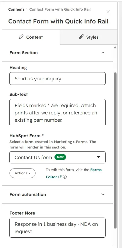
Figure 3 — Form section fields in the content editor.
Step 3: Configure the Quick Info Rail
Under the Quick Info Rail group:
- Show Quick Info Rail — Toggle the entire rail on/off. When off, the form spans the full width.
- Contact Items — Add up to 6 rail cards. Each card has:
- Icon Type — Phone, Email, or Location (determines the SVG icon).
- Label — Uppercase label above the value (e.g., "Call us").
- Value — The primary content (e.g., phone number, email address).
- Meta Text — Supporting detail below the value.
- Link — Optional URL to make the card clickable.
- Note Card Title — Heading for the closing note card.
- Note Card Text — Body text for the note card.
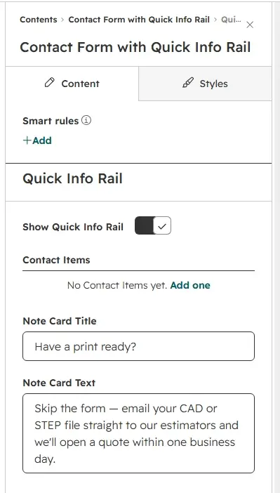
Figure 4 — Adding rail items with icon, label, value, and meta text.
Step 4: Adjust layout
Under the Layout group:
- Form / Rail Width Ratio — Choose between form wider (1.3fr 1fr), equal width (1fr 1fr), or rail wider (1fr 1.3fr).
- Column Gap — Space between the form and rail columns in pixels.
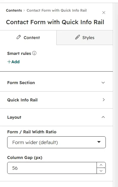
Figure 5 — Layout options: form wider, equal, or rail wider.
Step 5: Style the module
The Style tab provides extensive customization organized into groups:
- Section Background — Section background color and top/bottom spacing.
- Typography — Seven independent font controls: heading, body, label, note, rail heading, rail label, rail body.
- Form Wrapper — Card background, border, corner radius, and padding.
- Submit Button — Custom button styling (requires copying CSS to HubSpot form editor).
- Form Fields — Field colors, borders, and focus states (reference values for HubSpot form editor).
- Rail Cards — Card background, border, radius, padding, hover shadow, icon colors.
- Rail Note Card — Note card background, border, radius, padding, and text color.
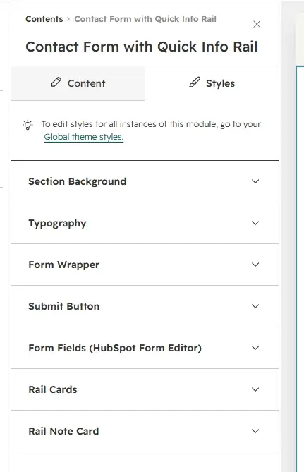
Figure 6 — Style tab with section, typography, and component style groups.
Step 6: Preview your changes
Use the Preview button in the HubSpot editor to see how the module looks with your content and style settings. Toggle between desktop, tablet, and mobile views — the module is fully responsive and stacks to a single column on mobile.
Figure 7 — Desktop and mobile responsive views.
3. Quick Reference
Content Tab Fields
| Group | Field | Type | Default |
|---|---|---|---|
| Form Section | Heading | Text | Send us your inquiry |
| Sub-text | Text | Fields marked * are required... | |
| HubSpot Form | Form | — | |
| Footer Note | Text | Response in 1 business day | |
| Rail Items (repeating) | Icon Type | Choice | phone |
| Label | Text | Call us | |
| Value | Text | +1 (800) 555-0148 | |
| Meta Text | Text | Mon–Fri · estimating desk | |
| Link | Link | — | |
| Max 6 items | 3 default | ||
| Rail Note | Note Card Title | Text | Have a print ready? |
| Note Card Text | Text | Skip the form... | |
| Layout | Form / Rail Width Ratio | Choice | 1.3fr 1fr |
| Column Gap | Number | 56px | |
Style Tab Groups
| Group | Key Controls |
|---|---|
| Section Background | Background color, top/bottom spacing (px) |
| Typography | Heading, body, label, note, rail heading, rail label, rail body fonts |
| Form Wrapper | Background, border, corner radius, padding |
| Submit Button | Custom toggle, font, bg/text/hover colors, radius, padding |
| Form Fields | Label font, field bg/border/focus/text/placeholder/radius, select arrow |
| Rail Cards | Background, border, radius, padding, hover shadow, icon bg/color |
| Rail Note Card | Background, border, radius, padding, text color |
CSS Custom Properties
All module styling is driven by CSS custom properties prefixed --contact-form-with-quick-info-rail-. These are set inline via HubL in module.html and consumed by module.css. Fallback values in the CSS ensure the module renders correctly even without HubL context.
Responsive Behavior
At viewport widths below 768px, the two-column grid collapses to a single column. The form and rail stack vertically with a 40px gap. Form wrapper and card padding reduce to 24px for tighter mobile spacing.